- Home
- Help & Ideas
- Ideas
- Add histograms to segments leaderboards
- Subscribe to RSS Feed
- Mark as New
- Mark as Read
- Bookmark
- Subscribe
- Printer Friendly Page
- Report Inappropriate Content
- Subscribe to RSS Feed
- Mark as New
- Mark as Read
- Bookmark
- Subscribe
- Printer Friendly Page
- Report Inappropriate Content
Hello,
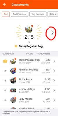
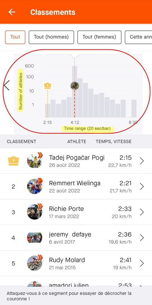
When you check one of the segment's leaderboards, you see your position compared to the others, but it could also be nice to show it in the form of an histogram (frequential distribution of the times of everyone and where you stand in there).
Adding one histogram inside of each leaderboard (or at least the "All" one) would provide interesting information on if you're part of the most common times or no.
We already have such information in the Local Legend feature, with an histogram showing the number of efforts.
Here is an example of what it could look like:
It is important to me because I don't feel it's enough to know if I'm in the Top X people of the segment, I would also like to know where most of the people stand and see where I stand in this gaussian distribution.
Thanks you for reading. (The paragraph below is for devs and maths people).
Implementation thoughts :
The Y axis would of course be the number of ahtletes, but for the X axis it's a bit harder.
It could be seconds per seconds, but that would make a lot of bars. So maybe say that one bar represents all the people in an X seconds range, with X being a percentage of the segment time.
And then decide what should be the segment time for this calculation (KOM, Average, Max...), see which one gives the most readble results.
You must be a registered user to add a comment. If you've already registered, sign in. Otherwise, register and sign in.
- New Idea 27
- Gathering Kudos 811
- Under Consideration 8
- Existing 106
- Delivered 40
- Archived 424


