cancel
Showing results for 
Search instead for 
Did you mean: 
Silentvoyager
Superuser
Superuser
Status: Open To Voting

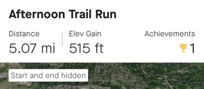
Considering how much screen space each activity takes in the feed, which is almost entire screen, it is strange there is enough space for only 2 or 3 activity metrics. Often it is just distance and elevation gain, and even duration isn't shown, like in the screenshot below. Imagine someone doing a monster effort and spending 30+ hours doing an ultrarun, and then the time ends up not being shown so others cannot fully appreciate the effort. Arguably, spending that much time on feet is an achievement by itself.

Furthermore, in the example below, why there are only two fields shown? There is enough space for the 3rd field. But it seems the horizontal space is taken by the "Achievements" word which I think is completely redundant. 

Screenshot_20220907-172054.png

And furthermore, I think the feed would likely be much improved by taking two rows to display activity fields.


11 Comments
Jane
Moderator Moderator
Moderator

Hi Silentvoyager,

Thanks for your feedback!  Based on your screenshot, you are talking about the Mobile Feed, not the Web Feed, correct?

The activity data you see on your Mobile Feed/dashboard may be slightly different from activity to activity depending on the activity type and the activity itself.

For example, for a running activity, the elevation will appear in place of pace/speed if the elevation gain is greater than 100ft per mile. Otherwise, pace/speed will be visible on the dashboard. 

The information you see may also be dependent on the length of the text. For example, if you are not seeing elevation or pace but an empty space this may be because the time and distance take up more room on the screen, and therefore the next set of data (elevation or pace) is not displayed since there is limited room.


Jane (she/her)
STRAVA | Community Hub Team

Silentvoyager
Superuser
Superuser

Yes, exactly. This post is about the mobile feed. I think most users use the mobile app most of the time. 

I understand that the way it is currently implemented the app UI can't show more content because there is no room. But my two points are:
1) There is actually a room as you can see on my screenshot, and with some small changes in the UI implementation it could very well fit one more field. For example it is kind if silly that the space is taken by the redundant "Achievements" word at the top. I know those are achievements already and there isn't a need to repeat that in every single activity in the feed. This UI is an example of "form over function".
2) Why there isn't a second row of data fields? Considering how much space is taken by other stuff, it is kind of strange that there is so little screen space is given to the information that actually matters.

And by the way, why can't I edit the title of my post? I made a typo by typing "shoe" instead of "show" (could be an auto-correct on my phone) and now there doesn't seem to be a way to fix that.

Status changed to: Open To Voting
Jane
Moderator Moderator
Moderator

Hello,

Thanks for getting back to us!  Sorry you weren't able to edit the post title - I've corrected that now.

I have moved your idea regarding the Mobile Feed to our Ideas board, so that others can also vote on your idea.  You can view the post here. Feel free to comment on your post to add any details, screenshots, or tags. We kindly ask that you review our Ideas guidelines, particularly the “What makes a good idea” section, to ensure that your ideas are clear, concise, and can reach as many others as possible.

Thank you for your contribution, we value your input.


Jane (she/her)
STRAVA | Community Hub Team

Mandrusier
Shkhara

I totally agree

Silentvoyager
Superuser
Superuser

@Jane,

Here I tweaked my phone settings to make the font size as small as possible and the scaling as small as possible. This makes everything extremely tiny on my screen. Still, despite having tons of space the app displays only two data fields:

1000005179.png

Do you have any explanation for this? 

ReLiz
Mt. Kenya

I agree. Pace is more important than elevation. Please allow users to customize their Strava stats. It’s frustrating to not see the pace on the headline of every run. 

Mandrusier
Shkhara

Thanks for the post, we need to get this changed 

Jakobbentzen
Mt. Kenya

I have resently had a problem with the stats that show on the Strava Dashboard. I would like to be able to choose which stats that are shown. I Can for example see the avg power on my runs, but i would much rather be able to see my heart rate there.

MegFrizelle
Mt. Kenya

How do I change my viewing so that I just see distance and pace on runs, bike and swimming?

Jan_Mantau
Superuser
Superuser

@MegFrizelle You can't

JoelWaters
Shkhara

Can we promote this idea a bit more? Time is especially important on a race. Particularly running races that have set distances. I did a 10km running race on the weekend. The metrics shown on the mobile were distance, pace and achievements. I understand time will be shown if there are no achievements. Surely time and distance are the most important data field.