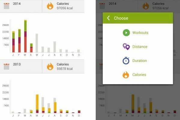
Feature: Dynamic Histograms for Yearly Comparison
- Allow users to compare their training load month-to-month across different years using interactive histograms.
- Each bar represents a month, with different colors or layers indicating specific metrics (e.g., distance, duration, calories burned).
- Users can switch between metrics like Workouts, Distance, Duration, Calories for each year to compare performance in a specific month.
Enhanced Drill-Down View:
- Include the ability to click on individual months to dive deeper into detailed statistics. For example:
- Workouts completed
- Average pace, elevation gain, heart rate zones
- Top workouts of that month
- Display year-to-year progression, showing the change in individual values over time, helping users understand how their training volume and load evolved.
- Include the ability to click on individual months to dive deeper into detailed statistics. For example:
This feature would allow athletes to better monitor their training load and adjust their workouts to achieve better results while seeing progress and avoiding overtraining.


