Hello. I have been using Strava for over two years already and I find it to be a great community and tool to meet athletes and to improve sport performance. I do have one comment though.
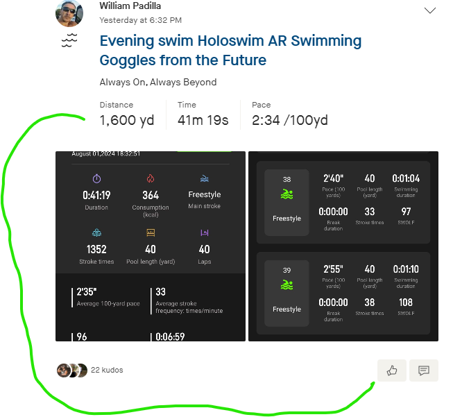
it seems like when you are going through the activities and you are trying to get kudos, the activity distance and metrics are on top of the picture, but scrolling down to give kudos actually makes it difficult to see the metrics. I believe it could be better if Kudos and metrics are on the same line below the activity picture or map. It would help realize the progress and give kudos for actual progress.
for instance: when I scroll on my phone to give kudos I miss the info of the activity. I put myself as an example.

Regards
William


