
Hey there,
I've been comparing Strava's analysis of single gpx files to other platforms and something that appears to be quite striking is how the pace plots for an activity differ from those made on the same activity using alternative analysis tools out there. I am trying to understand roughly what might be the largest contributors to this difference...
The main two things I would like to clarify for myself:
Is the pace plot downsampled from the available gpx data?
Does anyone know what smoothing algorithm is being employed?
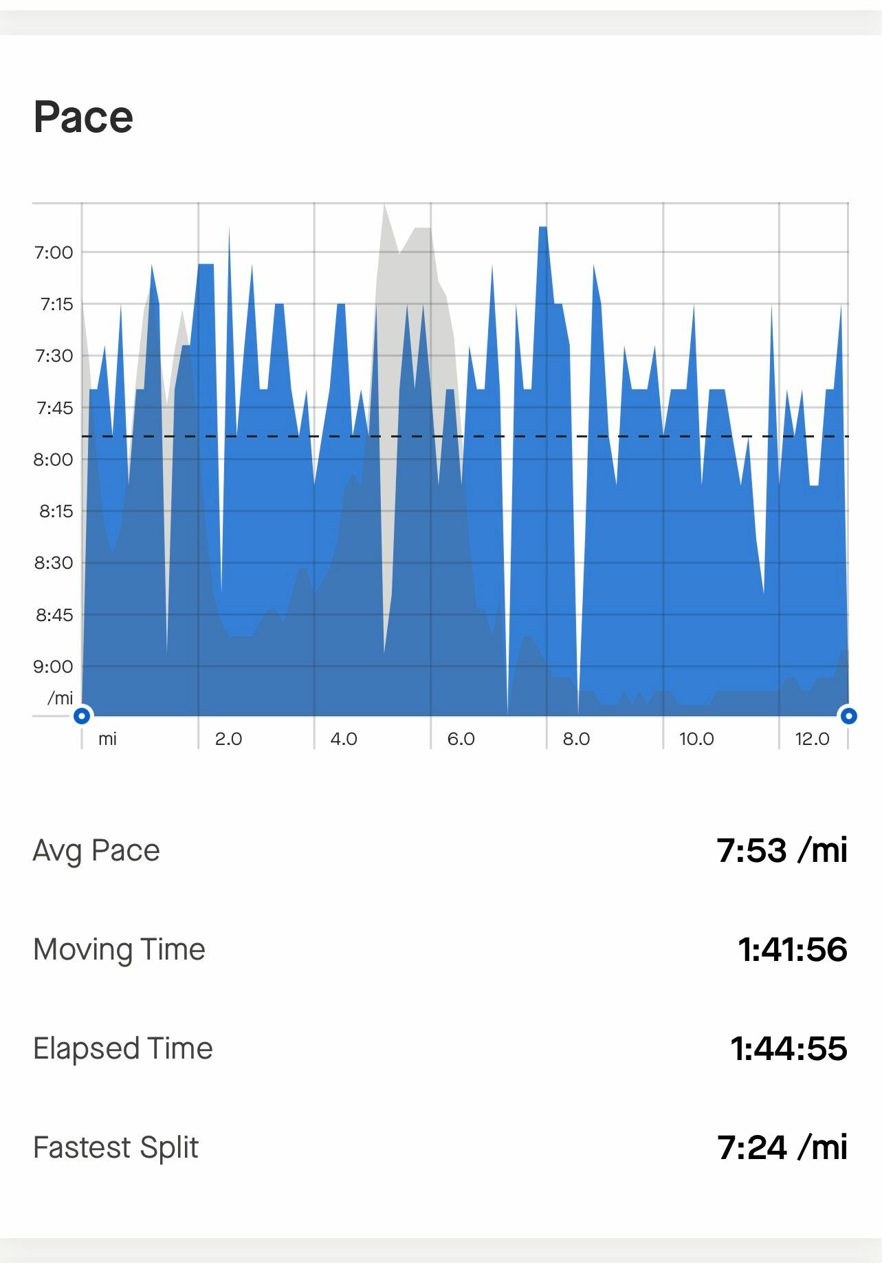
Thanks in advance! I've attached a screenshot of the UI element I am referencing ( taken from the mobile app) to hopefully shed some light on which of the many different pace plots I'm referring to here...