My phone is setup to use larger fonts to help with declining eyesight. I find that the Strava app has a number of rendering issues where important content doesn't fit properly.
Here are two most obvious examples, but likely there are more:
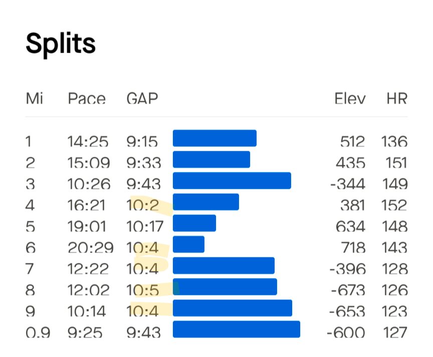
1) In the splits rows have insufficient height.also, GAP has insufficient width, which results in losing one digit in some rows

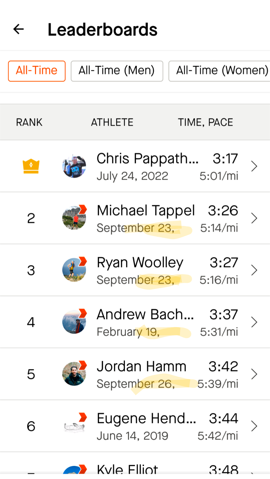
2) In segment leaderboards, many entries don't have their year rendered. I'd say, the year is probably the most important part of the date, to tell you how old the attempt was made, followed by the month. Perhaps Strava could fix this by using a different date format, for example by using abbreviated month or numeric month. Also, perhaps this could be improved by reducing the whitespace.


