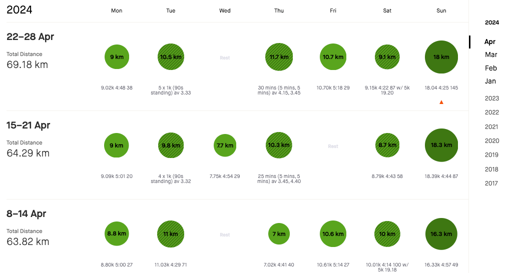
This black on top of dark green is really bad and hard to read. I thought it was an error rendering when I first saw it, but it's changed on phone and desktop. Please change back.

 +5
+5This black on top of dark green is really bad and hard to read. I thought it was an error rendering when I first saw it, but it's changed on phone and desktop. Please change back.

Enter your E-mail address. We'll send you an e-mail with instructions to reset your password.