The Hub is now in read-only mode as we make improvements to the Hub experience. More information is available here.
03-20-2024 09:11 AM - last edited on 03-28-2024 07:32 AM by Scout
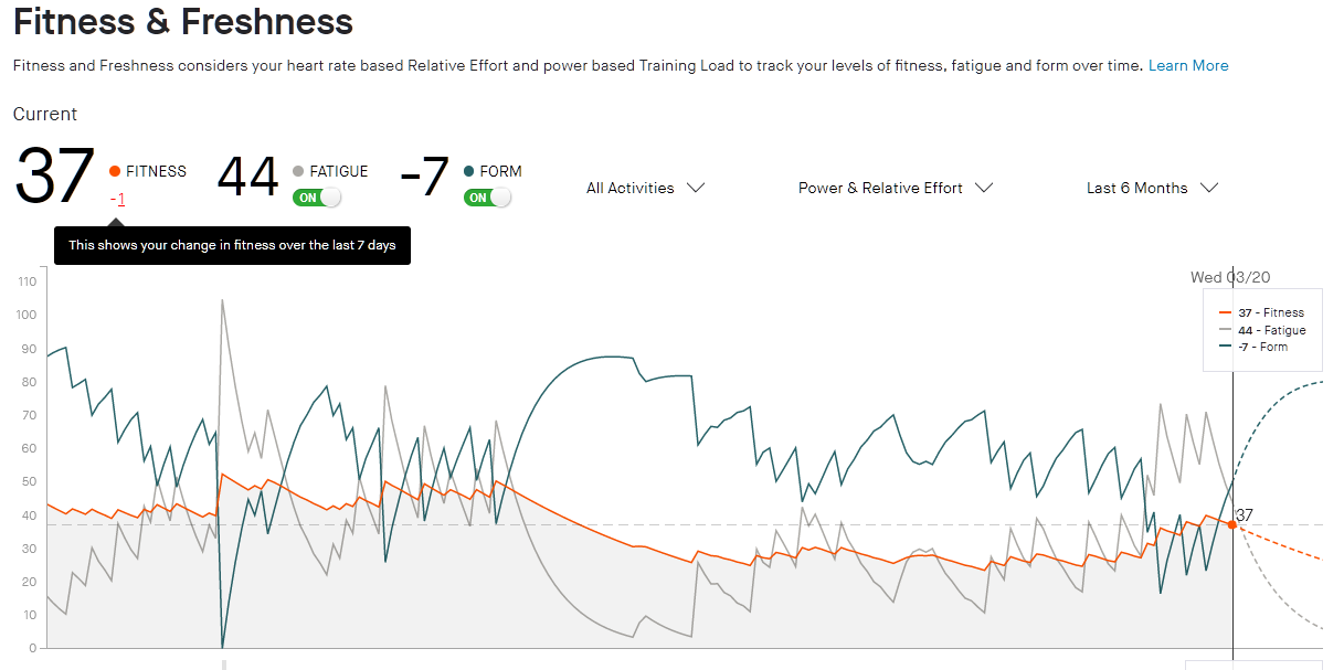
The Fitness and Freshness chart has a scale on the left that starts at zero. But if your Fatigue is higher than your Fitness, your Form can go negative. When you view the Form line, it puts the lowest value at zero, even if it's negative. This makes your Form chart line sit higher than it should be. Hovering over the chart shows the correct values
03-20-2024 09:53 AM
It's not a bug, that is a normal method of displaying more than one line without making the chart vertically huge. If one athlete has a fitness over 200 and a negative form your proposal would lead to expanding the picture to unreadable proportions.
03-21-2024 02:18 AM
The chart already adjusts the scale on the left so that it's always the same height. That doesn't explain why the lowest point on the form line above (with a value of -38) is aligned with zero, and the current value of -7 is aligned with 45.
03-21-2024 05:51 AM - edited 03-21-2024 05:54 AM
In my example with the bigger difference between fitness and form leaving the y-scale the same height and separating both graphs would lead to a very flat "curve" for the fitness and form.
04-02-2024 02:35 AM
Are you saying it's better to show the data wrong as long as it fits in the space available?
04-02-2024 06:01 AM
The data are not wrong, they're only missing a direct visible explanation what they mean.
Welcome to the Community - here is your guide to help you get started!