Hello Strava Community,
I’m reaching out to express my concerns regarding some of the recent changes to Strava’s map features, particularly focusing on the Global Heatmap color update that occurred a few days ago.
The recent update changed the color of the Global Heatmap from its familiar blue
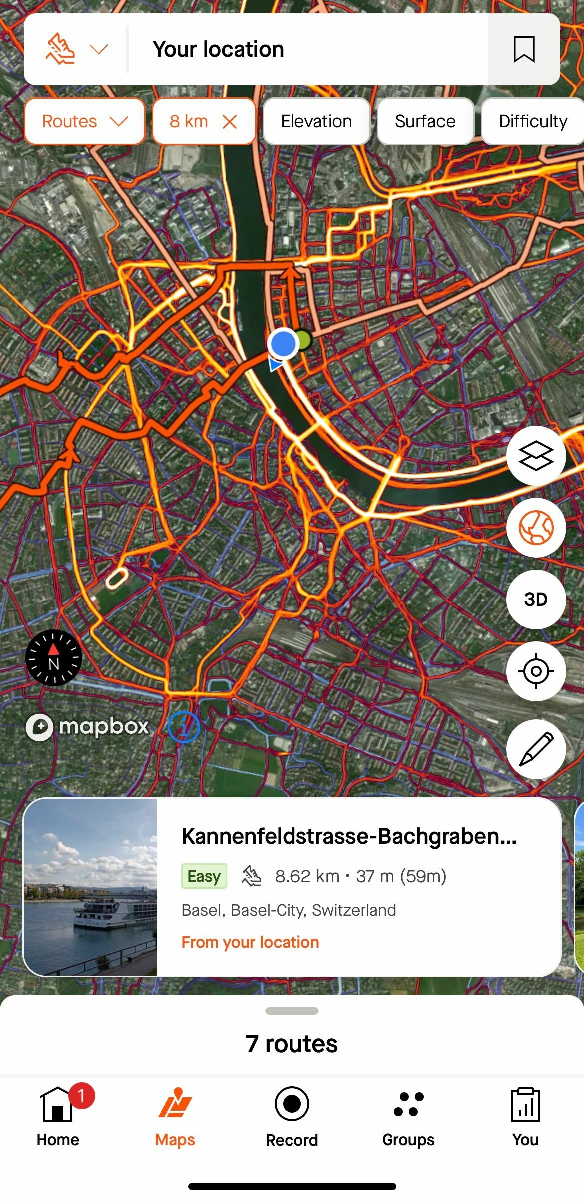
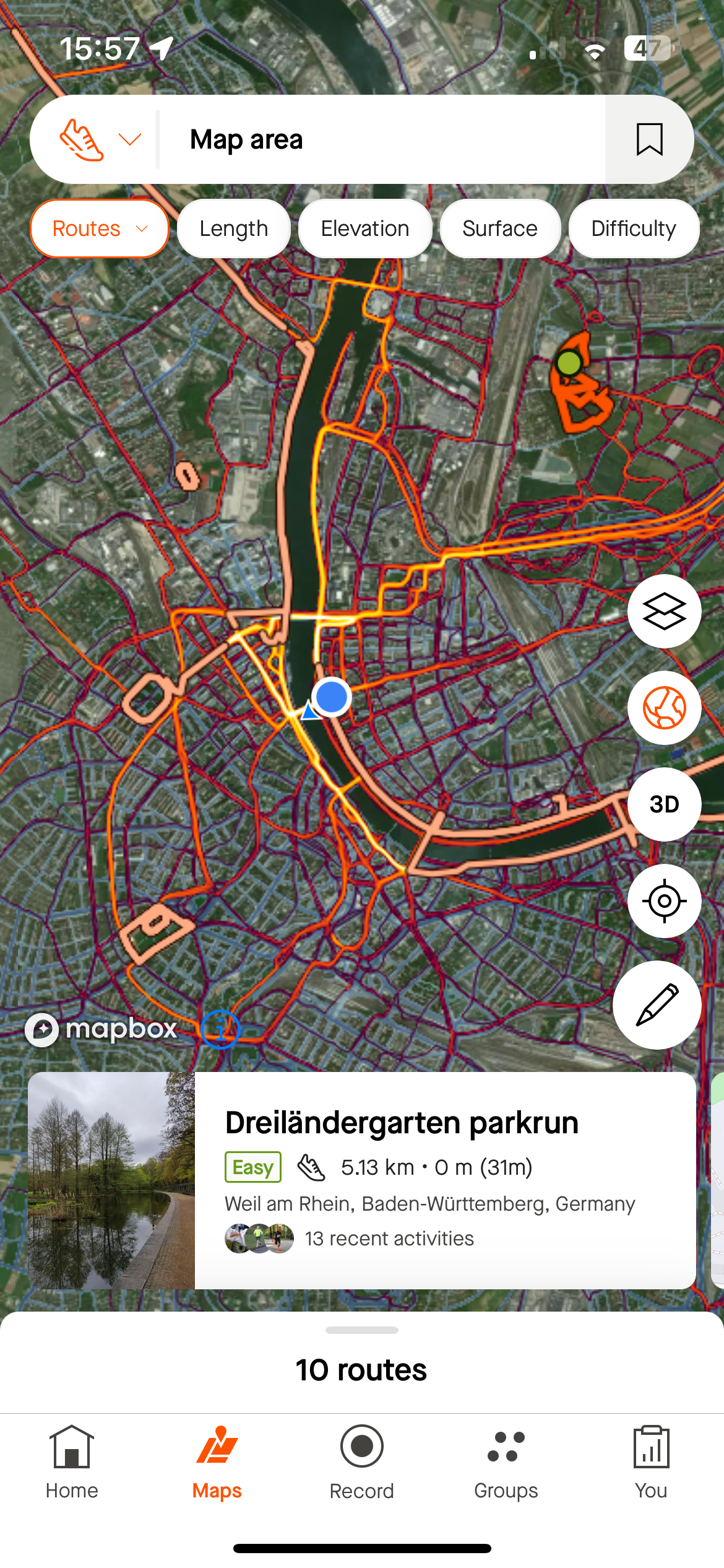
to a purplish hue. This new color blends too closely with the red of the Personal Heatmap, making it difficult to differentiate between the two, especially in Satellite View. This seemingly minor change significantly impacts our ability to read the maps accurately and make informed decisions about our routes.
New Purple:

Old Blue:
I understand that this might seem like a small adjustment, but it represents a step in the wrong direction, making it just a bit harder to interpret and use the maps effectively. This issue is compounded by other recent changes, such as the forced route suggestions that clutter the map and detract from its clean and useful design as seen in this screenshot of my Maps tab.
To address these concerns, I suggest the following improvements:
- Revert to Previous Colors: Consider reverting the Global Heatmap color back to blue to restore the clear visual distinction between the global and Personal Heatmaps.
- Color Customization: If maintaining the new color is necessary, allow users to customize the colors of the Global Heatmaps just like we are able to with the Personal Heatmaps. This would enable us to select the most complementary pair, enhancing readability and usability.
These changes could help restore the functionality and clarity that made Strava’s maps so valuable in the first place.

