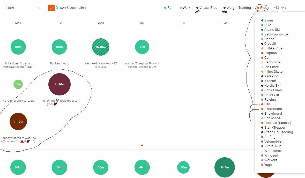
I different types of workouts on Strava and the training log ends up a bit of a mess. For some reason there is a huge differentiation in color for Ride (strava orange) vs Virtual Rides (redish-brown)... but then "Weight Lifting" is also redish-brown?? Makes viewing and looking for trends/patterns and planning upcoming activities tricky. Can someone update these colors, or maybe default to some different ones based on what is used? 
For instance if someone only uses Strava for Rides, Golf, Football, Sailing, and Skateboarding... every circle would be ORANGE based on the legend. Can this maybe be adjustable?
Can Ride and Virtual Ride be closer in color so as to not be the same as WeightTraining?


