This website uses Cookies. Click Accept to agree to our website's cookie use as described in our Privacy Policy. Click Preferences to customize your cookie settings.
Turn on suggestions
Auto-suggest helps you quickly narrow down your search results by suggesting possible matches as you type.
Showing results for
- Home
- Help & Ideas
- Ideas
- Display Elevation on the Activity page on the same...
Options
- Subscribe to RSS Feed
- Mark as New
- Mark as Read
- Bookmark
- Subscribe
- Printer Friendly Page
- Report Inappropriate Content
shivk
Shkhara
Options
- Subscribe to RSS Feed
- Mark as New
- Mark as Read
- Bookmark
- Subscribe
- Printer Friendly Page
- Report Inappropriate Content
09-08-2023
07:09 PM
Status:
Open To Voting
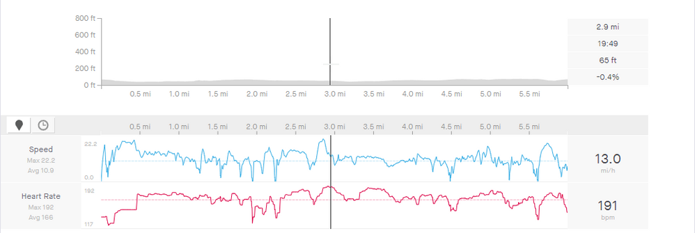
In its current state, the height/elevation graph does not effectively visualize my activities. I think it'd be better if it calculated the axis range based on values, similar to speed and heart rate.
See more ideas labeled with:
6 Comments
You must be a registered user to add a comment. If you've already registered, sign in. Otherwise, register and sign in.
Idea Statuses
- New Idea 47
- Open To Voting 752
- In Development 0
- Delivered 51
- Existing 157
- Not Currently Planned 644


