- Home
- Help & Ideas
- Ideas
- UI Change Request: Click to Expand Profile Menu
- Subscribe to RSS Feed
- Mark as New
- Mark as Read
- Bookmark
- Subscribe
- Printer Friendly Page
- Report Inappropriate Content
- Subscribe to RSS Feed
- Mark as New
- Mark as Read
- Bookmark
- Subscribe
- Printer Friendly Page
- Report Inappropriate Content
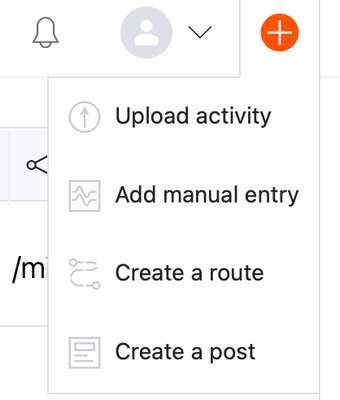
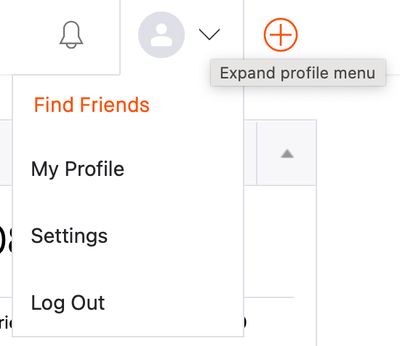
Strava, would you please require a click to expand the menus in the top-right corner of the main webapp? I’m talking about these 2 buttons:
Right now, they expand immediately on hover, and I cannot tell you how many activity Descriptions I’ve lost, just because I quickly moved my mouse too far when trying to Save.
As you can see in my second screenshot, the downward arrowhead ⌄ ironically offers a mouseover tooltip, but it’s completely useless since the menu expands before the tooltip.
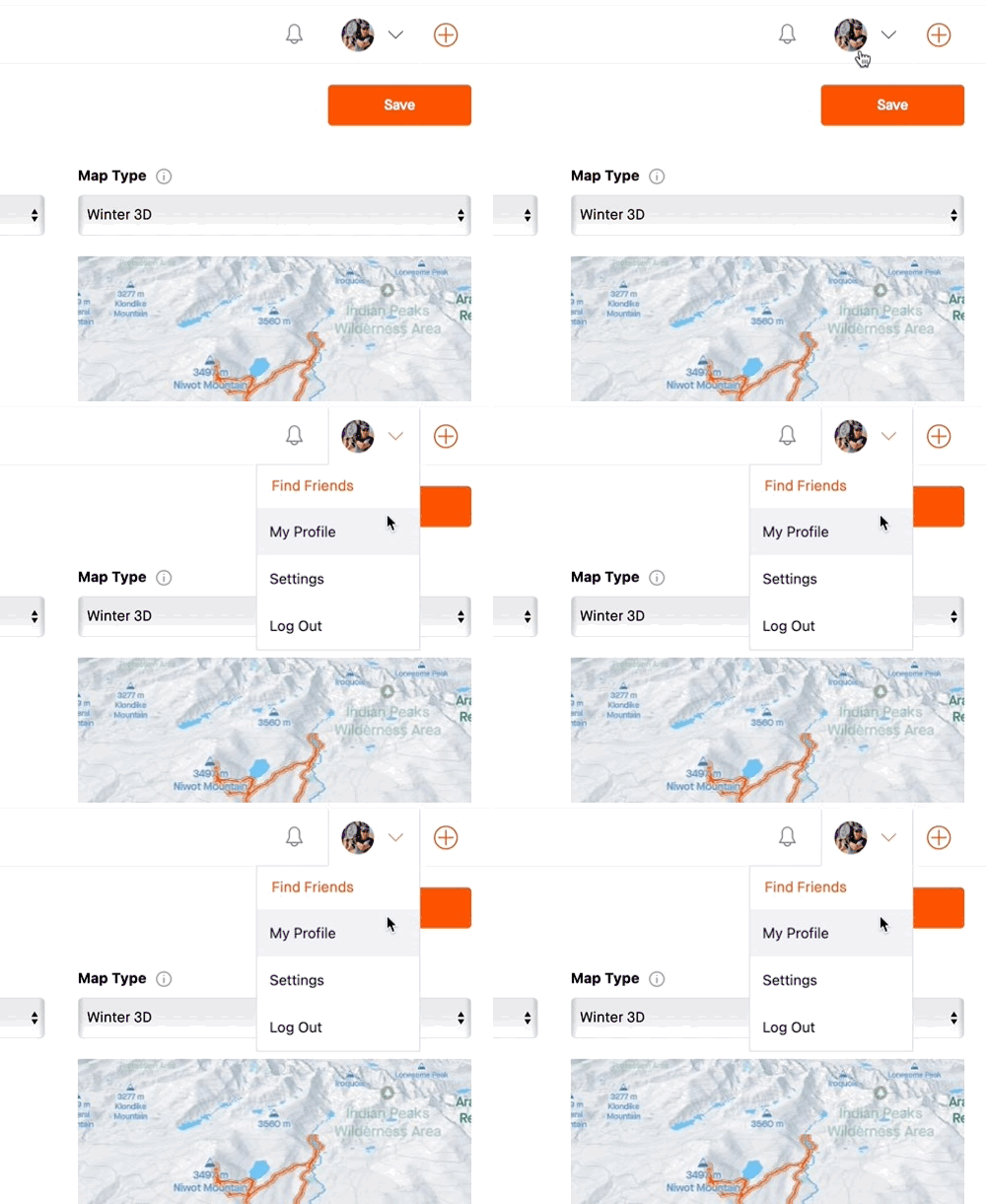
Here’s a screen recording to illustrate:
What makes this especially bad is that the browser (Safari in my case) should normally detect that the page contains unsubmitted form data, and ask for confirmation before navigating away. However, Strava seems to use a nonstandard textarea on the activity Edit page, which disables this safeguard. In the screen recording, the hand turns into an arrow upon clicking, indicating that the browser is immediately navigating away, and that all fields on the page become disabled. Once that happens, you there is no way to salvage your Description.
I’ve looked at a handful of social websites. Facebook requires a click, whereas AllTrails also expands the menu immediately. However, AllTrails uses the browser’s full width, which puts that menu well out of the way of any accidental clicks. They may also use standard textareas, which would allow the browser to ask for confirmation before navigating away, but I did not test that.
Most notably, the Notifications menu (right next to the Profile menu) requires a click, which is highly inconsistent. Meanwhile, the Profile menu on the Strava Community Hub also requires a click to expand.
You must be a registered user to add a comment. If you've already registered, sign in. Otherwise, register and sign in.
- New Idea 46
- Open To Voting 753
- In Development 0
- Delivered 51
- Existing 157
- Not Currently Planned 644


