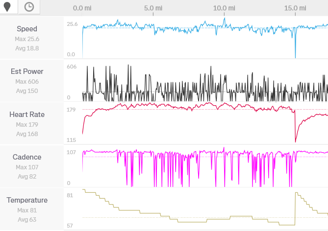
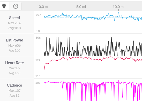
Strava browser web view is archaic and hasn’t changed in 10 years or more!
- Does Strava have any plans to update this view and make it match the more modern Android app data display?
- How do I make heart data always display in web view?
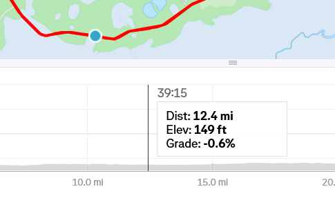
- Mousing over the graph below the map in webview is the only way to obtain certain data, such as the current BPM or the starting/ending minimum heights. However, the resolution is poor, with a spacing between data points of about 15 seconds. This is unacceptable.
- 4. When mousing in webview, it is difficult to control the mouse in small increments. Should be able to use the cursor keys to move left/right in 1 second increments.
- Splits should show average and max BPM, if available.
- Webview shows the moving time and pace but not the average speed.
- “Elevation” should be changed to “elevation gained”, otherwise people might confuse the number with max elevation.


