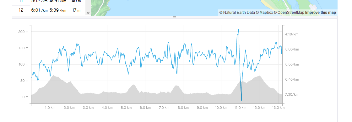
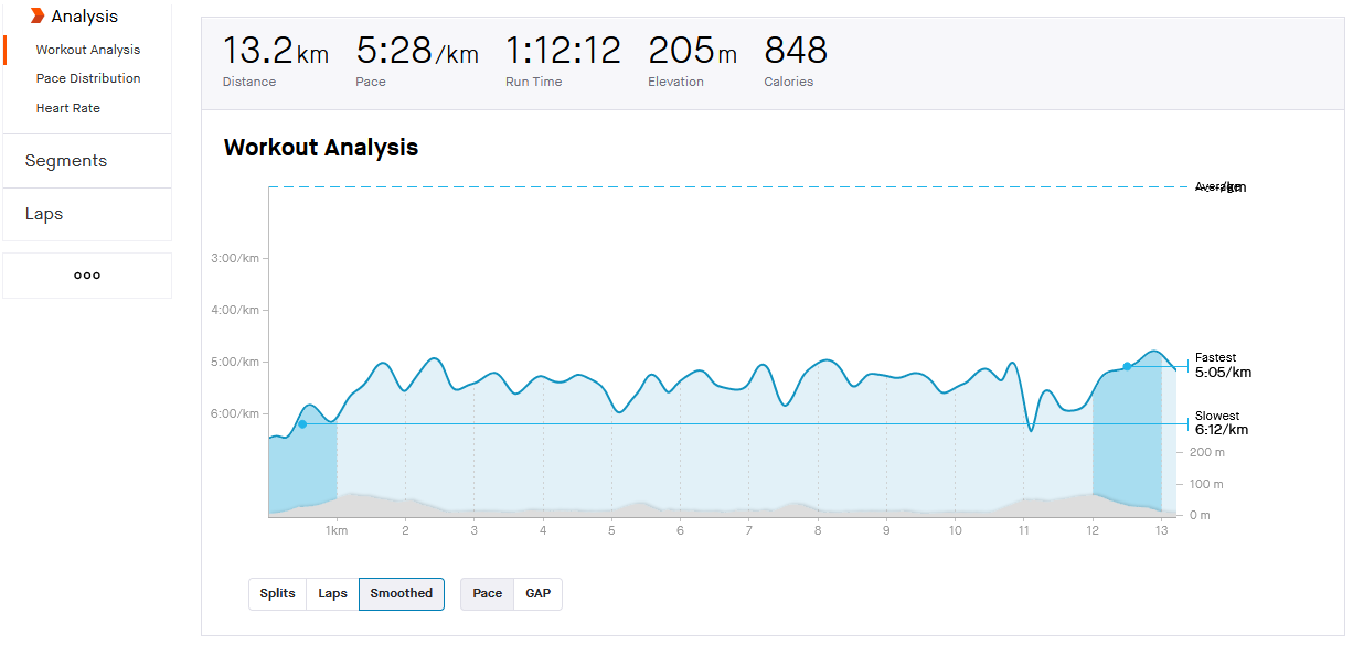
I am under impression that upon upload from external devices Strava discards any speed data and then rebuilds from distance distance changes over time. As a result the running pace graph looks much more noisy and spiky than pace graph for the same activity in e.g. Garmin Connect. I'd say that in general it is very hard to use Strava pace graph for any kind of analysis - it is just too noisy to see any trends. Perhaps Strava should either be applying some smoothing or, when available, just use the original speed/pace data from the device. Many modern devices fuse the running pace data from both GPS and accelerometer which makes it way more stable than GPS based pace alone, and Strava should try to preserve that. 


Hello!


Thanks for sharing your thoughts on pace graphs.  This sounds like the perfect idea to share to our Feature Suggestion board, so that others can also vote on your idea. We kindly ask that you review our Feature Suggestions guidelines, particularly the “What makes a good idea” section, to ensure that your ideas are clear, concise, and can reach as many others as possible.


Thank you for your contribution, we value your input.


Ok, I can repost this. I thought my post was about an existing feature - that's why I posted it here. 


Hi.  Apologies for any confusion.  Since your idea is about a change to an existing feature, the Suggestions Board is the best place for it.  Thank you so much.


Hi @Silentvoyager ,
Strava has a smooth option but it is only available for activities shared by Strava subscribers 😞


Reply