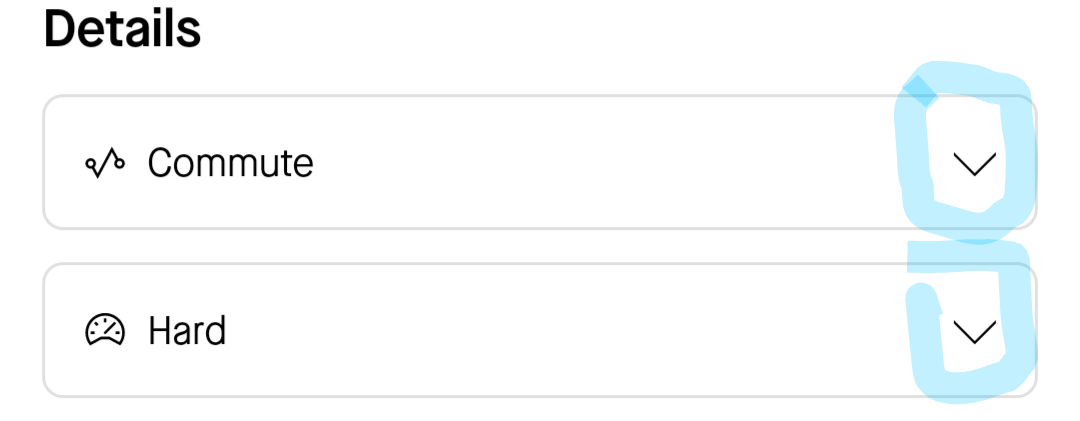
Some recent release of the Android app has broken the dropdown menus. Pressing the actual down arrow at the right hand side of each menu has no effect.

This is a long way from being the most broken feature on the app, but it's a bizarre choice if intentional, flying in the face of several decades of UX best practices. It's also consistently annoying as I keep pressing at it unconsciously as the arrow is not only closest to the digit of a right-handed user, but also acts as a visual call to action.
Of course based on the triage process around here I look forward to years of gradually learning to not press the inactive button that looks like it should do something. Thanks!


