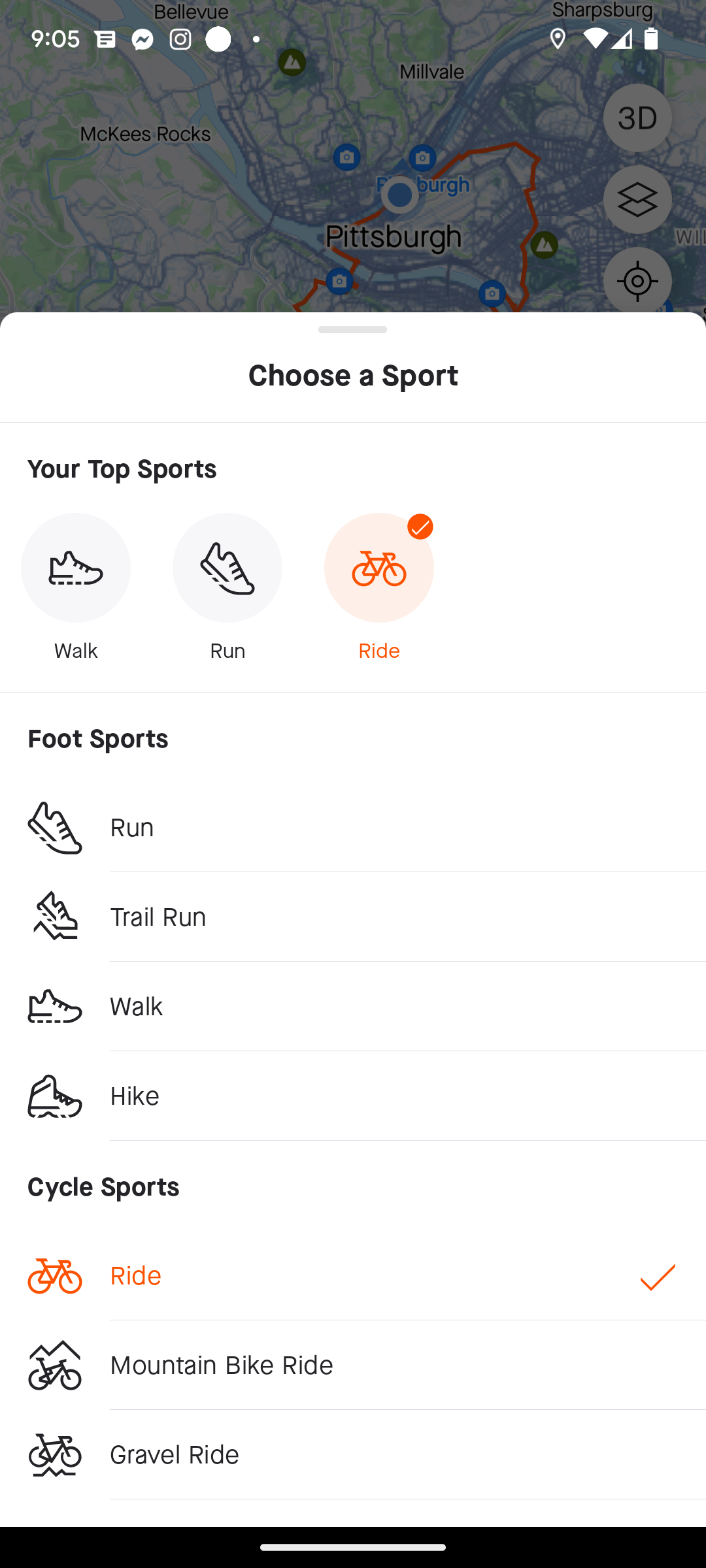
The mobile route builder is very poor quality at the moment. Not being able to choose terrain is a no-go on many road bikes. If you're touring and have no easy access to the desktop version, it's basically useless. Last time it tried to guide me up a mountain through a steep dirt trail instead of following a slightly longer paved road. There is a lot of MTB around, don't get the heatmaps mixed up!
Speaking of gradients: also on desktop, why not have a filter based on max grade and not only elevation? Sounds like a neat idea.
Speaking of desktop version on mobile: constantly redirecting me to the LIMITED app is simply annoying. I am using my browser instead of the app on purpose! Just ask the user whether they want the desktop or mobile version when they enter the website, like most others do.
Speaking of heatmaps: it is not clear to me whether each activity type has their own or they're shared. If they're all mixed up, hikers, MTB cyclists and road cyclists will all be confused, as well as, apparently, the mobile version of the route planner.
At that point you might as well use something free like Google maps, as I ended up doing. At least it has live rerouting (Strava should implement this at some point to be more of a sports app than a social platform) and voice notifications before turns.
Basically, I am very disappointed of Strava as a navigation tool. 1/5 stars at best. The only way it works now is if you are on a training ride that has been planned and mapped some days prior on a desktop, synced, and if you never miss a turn, while looking at your display most of the time to not get lost.
Giving feedback is not easy and straightforward
Going into the support section from the app doesn't work due to security issue 403, whatever that means.
From a frustrated long term subscriber,
Stefan Vasilev


