- Home
- Help & Ideas
- Ideas
- Better Fitness and Freshness chart for long term a...
- Subscribe to RSS Feed
- Mark as New
- Mark as Read
- Bookmark
- Subscribe
- Printer Friendly Page
- Report Inappropriate Content
- Subscribe to RSS Feed
- Mark as New
- Mark as Read
- Bookmark
- Subscribe
- Printer Friendly Page
- Report Inappropriate Content
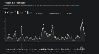
I use fitness and freshness to check my prepararedness for big events going back for years. I like to compare exact status just before a big event from 5 years ago. The current view levels of (3M ,6M ,1Y, 2Y & All time) dont allow for this (see the image of how busy the chart is). At All Time, 1Y and 2Y its virtually impossible to put the mouse on a specific date you want to check to see your stats or see pre-training events. Fitness and freshness is one of the main reasons i subscribe to Strava rather than use the free service. I like to have a rough guage of my fitness level without having to resort to paying for another tool or device to do so e.g. Training Peaks, Whoop etc,
As work arounds I've tried zooming in the browser and using the keyboard once an item is clicked on to get better definition and selection of specific dates but none of these options work. The alternative of using the Training Calendar are no good as they dont show Fitness and Freshness scores. A few suggestions to improve the experience of Fitness and Freshness :
- Update the UI to allow 'drag and zoom' on the chart. I've tried various browsers with no sucess.
- Allow the keyboard arrow keys to be used to move left or right one day at a time after having clicked on an approximate date with the mouse.
- Show fitness and freshness values on each activity in other areas of Strava (including the training calendar).
- Allow the export of Fitness and Freshness data so it can be graphed in Excel etc.
Thanks
You must be a registered user to add a comment. If you've already registered, sign in. Otherwise, register and sign in.
- New Idea 4
- Gathering Kudos 794
- Under Consideration 8
- In Development 0
- Delivered 48
- Existing 139
- Archived 549


