This website uses Cookies. Click Accept to agree to our website's cookie use as described in our Privacy Policy. Click Preferences to customize your cookie settings.
Turn on suggestions
Auto-suggest helps you quickly narrow down your search results by suggesting possible matches as you type.
Showing results for
- Home
- Help & Ideas
- Ideas
- Make it easier to read: Make text on web activity ...
Options
- Subscribe to RSS Feed
- Mark as New
- Mark as Read
- Bookmark
- Subscribe
- Printer Friendly Page
- Report Inappropriate Content
dgcasey
Shkhara
Options
- Subscribe to RSS Feed
- Mark as New
- Mark as Read
- Bookmark
- Subscribe
- Printer Friendly Page
- Report Inappropriate Content
08-25-2022
01:05 AM
Status:
Not Currently Planned
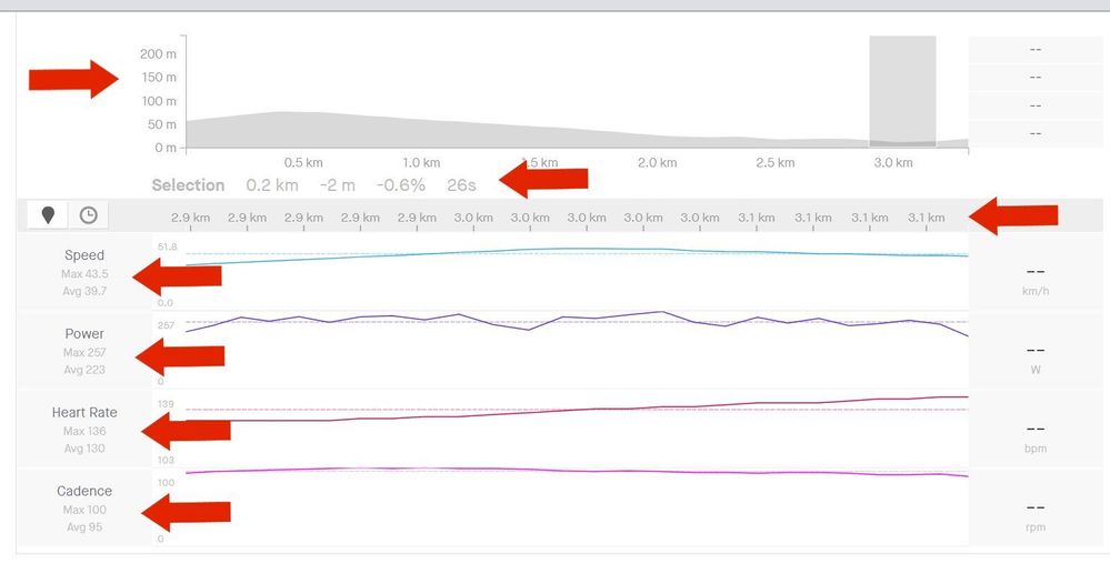
I would like to see some of the pages made a little easier to read. Some of us old folks have a hard enough time reading the website without some coder deciding light gray text on a white background is a good idea. I mean, come on, there's some places where there is gray text on a gray background. Give us old folks a little help here.
For example: When I am looking at the analysis page (pictured below) it is needlessly difficult to read the numbers on the left side of the screen. Make the text bigger and make it black.
See more ideas labeled with:
5 Comments
You must be a registered user to add a comment. If you've already registered, sign in. Otherwise, register and sign in.
Idea Statuses
- New Idea 46
- Open To Voting 753
- In Development 0
- Delivered 51
- Existing 157
- Not Currently Planned 644


