Hi !
When comparing the progress graph, the curves end or start to zero. It would be very nice to add one dot in graph to get nicer curves.
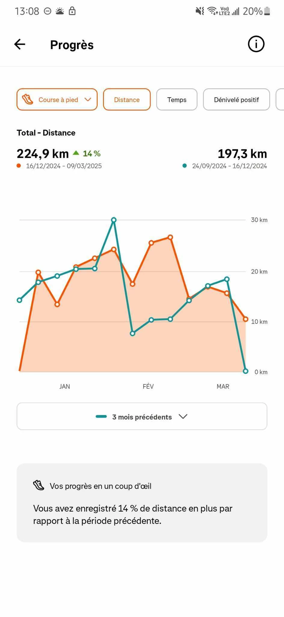
For instance, if you look to the image below: I am comparing 3 months with the 3 previous months. The blue curve ends to zero, and the orange curve starts at 0. However I didn’t take any break during the last 6 months. I am at least running 10km per week. So why do I get curve going to 0 ?
Actually the last white O symbol of the blue curve should get the value of the first orange O symbol of the orange curve.
Maybe the last 0 white symbol of the blue curve should not be displayed, like in the start of the orange curve there is no 0 white symbol (where the orange curve is 0). So the 0 white symbol could indicates on which segment (blue or orange) the week belongs to, if the symbol is on the orange curve, then this week was counted in the orange curve, and if the symbol is on the blue curve, then the week was counted inside the blue curve (for the total number of km, the total time, etc).
Then the value without 0 symbol should never be 0, but the real value of the corresponding week.
What do you think ?
Anyway, thank you very much for the great app !
Best,
J
Ps: below an example of the issue: