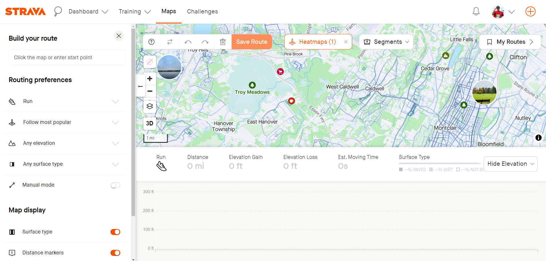
Over the past few days, Strava appears to have rolled out some new changes and, personally, don't feel these are for the better. A couple of "quality of life" changes appear to be reverted:
1) Heatmapping - prior to this update, there are two aspects of this that were better than the current version. First, cookies seemed to "save" your preferences. Each time I create a route, it now seems that I have to go into the heatmap drop down, unselect global, and reselect My Heatmap. Yes, takes 2 seconds but this is different from how it was prior.
The other problem is the intrusiveness of the heatmapping button which now overlays the map. This, along with the segment button, was a far better UX design as real estate on the map is limited (see next comment). Any time you are mapping routes to the northern and western sides of the map, these buttons frequently get in the way.
2) Show Elevation- Enabling this now takes up half the screen. With the addition of the Heatmap and Segment buttons, it effective shrinks the map to about a 1/3 of the usable space. While the "elevation profile" section isn't much larger, the middle bar with the activity type, distance, and elevation gain/loss seems to have doubled in size. Even on a 27" monitor, it becomes almost impossible to map with the elevation profile enabled.
3) "My Routes" button - Why would the UX team decide that overlaying this button over the map real estate was a good idea? Put it back where it was as a link in the top left where it doesn't impact any of the map.
- - - - -
I feel these changes haven't been for the better - they make mapping harder and less efficient. Not sure what others think but I definitely don't seem them as an improvement.
<image uploaded to show how little real estate is left after opening the elevation profile>


