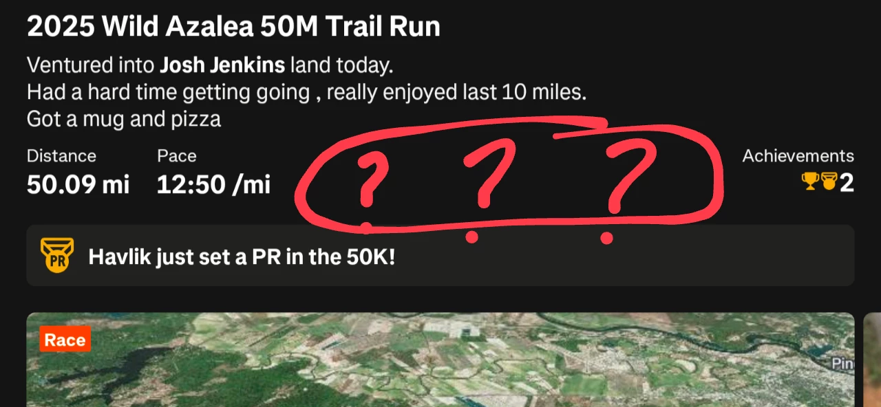
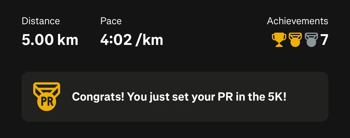
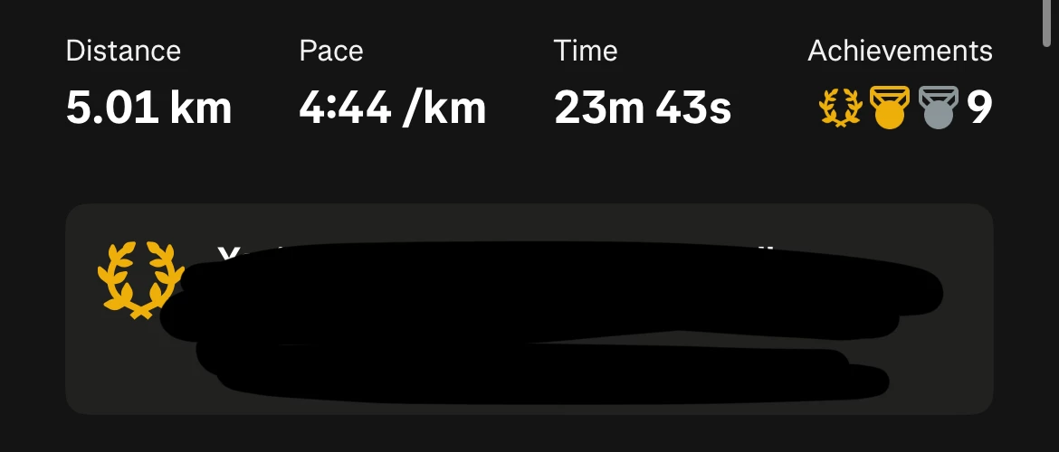
I am viewing Strava on a tablet with a large resolution screen. One of the people I am following has posted a race. You'd think that for a race, seeing the finish time is probably the most important piece of information. And yet, Strava insists on showings only two activity metrics even though this post takes nearly entire screen of my tablet. When I discussed this topic before, the answer was that the isn't enough space on the screen for more than 2 or 3 metrics, but as you can see that is clearly not true.

Can someone from Strava explain why activity metrics are the lowest in priority when it comes to the feed? Below the map, a huge part of the screen is dedicated just to showing the 3 icons - to thumb up, comment, and share. Personally, I don't think I've ever shared someone's activity, and to comment I always open activity details. But I want to see more activity details very often. At a minimum, when it comes to ultra running, the activity time is an achievement on its own. When someone spends hours grinding the distance, I want to see that and acknowledge the effort!
Please redesign the feed layout so that we can see at least 3 metrics for any given activity, including the time, regardless of whether there are achievements or not. I think a few small tweaks would make that possible. And ideally, there should always be 4 metrics - distance, time, pace or speed, and elevation gain. One simple idea is to move achievements to the right of the title and description and get rid of the redundant "Achievements" word. That alone would free enough space to always fit 4 metrics.


