Hey there,

I’m posting this as a general question/discussion and to see if anyone else shares the same sentiment:

Strava for mobile has been getting lots of love (i.e.: GUI upgrades, AI features, new mapping tools ) to name a few. 

I feel like the Strava for desktop does not have the same look/feel and other goodies. I can’t be the only one that uses both Desktop and Mobile and feel the disparity between both.  

It would be nice if Desktop would get a refresh 😎

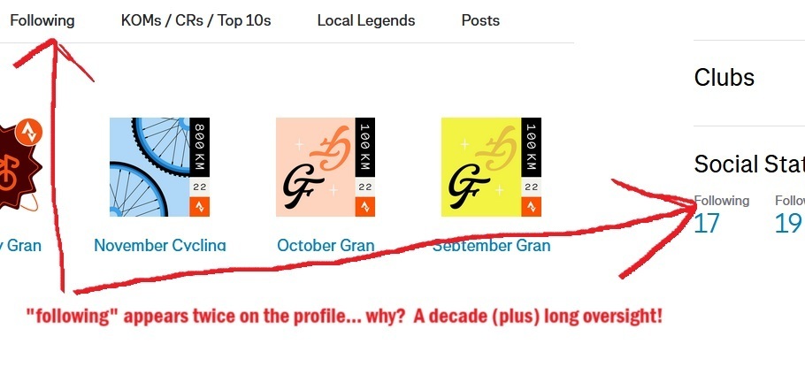
I'm in agreement.  I joined in 2014 and it's still roughly the same thing.  In fact it's got portions I don't even look at, the last 4 weeks total activities, the 4 week calendar bubble chart, and the activity breakdown bar graph.  (All to the right of your name and photo on most browser views.)   I wonder how many other users feel that real estate could go to better use.

In fact last year one of the admins asked what celebrations would you like to see…https://communityhub.strava.com/strava-features-chat-5/what-celebrations-would-you-love-to-see-incorporated-in-strava-905?tid=905&fid=5


I responded with some ideas and I thought we'd get something from that... but nada.    

...


More grist for the mill…


I quickly glanced through the post and your comments. I agree, there could be a bit of gamification added for long time Strava users. Badges and honourable mentions for kilometre or time achievements etc…


My post was specifically referring to the look and feel and discrepancy between mobile and desktop. I understand that most users take their mobile device to glance at Strava, but I’d say my usage is probably 50-50 and if I am planning a route I am definitely using a desktop. 


all that to say that it would be nice to see the Saint look and feel applied from mobile to desktop, including all the new features.


 Thanks for engaging in the discussion@JBW-Florida !


Reply