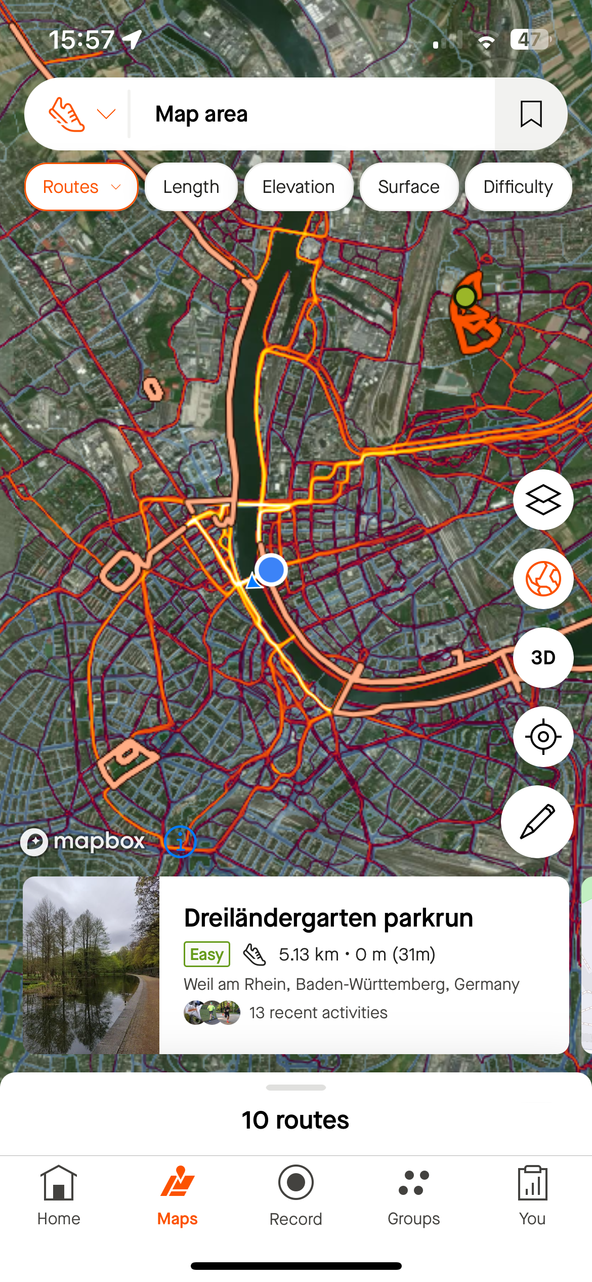
I’ve always appreciated the clarity and simplicity of Strava’s map tool, which has been indispensable for both planning my runs and navigating on the trail. However, the recent update has introduced new features that, while intended to enhance our experience, unfortunately clutter the map and compromise its ease of use. The additional information now overlays the map, making it difficult to focus on the essentials, particularly when I'm out on the trails.
While I recognize the good intentions behind these updates, the true value of the map tool for me has always been its straightforward, clean presentation, showcasing both global and personal heatmap data without unnecessary distractions. Previously, I could circumvent the issue of multiple route suggestions by switching to the 'Saved' tab, a workaround that's no longer available. Now, the route suggestion feature is omnipresent, detracting from my user experience. I'm not looking for an array of suggested routes each time I check the map; I need the ability to opt out of this feature.
The essence of my request is simple: the option to disable automatic route suggestions. Providing users with the flexibility to tailor their map view would significantly enhance the functionality of the app, ensuring that it remains a vital tool for navigation and planning without the added clutter.


