
As a longtime fan and frequent user of Strava, I really value the platform and appreciate the continued development. That said, I was surprised by the recent UI changes for subscriber profiles, and I wanted to share my concerns.
 

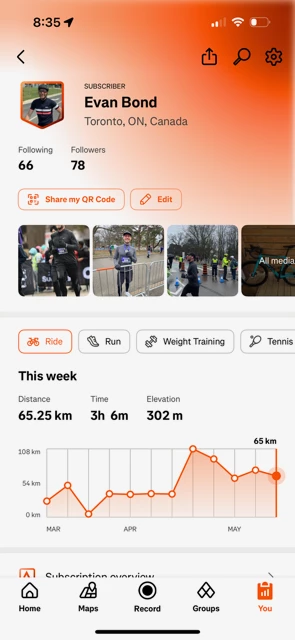
Orange Gradient on Subscriber Profiles

  • The orange gradient at the top of profiles makes interface elements harder to see—particularly the icons in the top right.

  • The dominant orange color inevitably clashes with user-generated photos in the carousel.

  • The gradient darkens into a muddy brown at the top, which further disrupts visual harmony.

  • A clean, neutral background would better support photo-focused content.
     

New Shield-Shaped Profile Photos

  • The switch from circular to shield-shaped profile pictures for subscribers feels like an unnecessarily bold change.

  • Compared to the subtle chevron used before, the shield shape stands out in a way that feels awkward—almost performative (and not in a good way).

  • It actually makes me feel self-conscious about being a subscriber.

  • Mixed avatar shapes across the activity feed also disrupt the clean, cohesive look that Strava typically does so well.
     

Subscriber vs. Non-Subscriber Visual Contrast

  • The stark visual distinctions between subscriber and non-subscriber profiles are too extreme.

  • These choices are detracting from the user experience rather than enhancing it.

  • A more subtle, thoughtful design would still highlight subscriber benefits without compromising the visual appeal of the app.
     

I'm sharing this in the spirit of constructive feedback (because I love Strava!) Thanks for listening and for continuing to improve the user experience. 🧡

Was directed here by another user, but I’m wondering if there’s any point to this? Looks like people have been commenting on the new UX/UI for a few months now and I don’t think there have been any meaningful changes as a result of that?

Anyways, I’ll throw a bit of commentary in. The new UI is really quite bad and looks incomplete. It really feels like they were doing a design system update and only got part way through it. If this is meant to be some sort of special treatment for users who are paying for the app, Strava, you’ve really missed the mark here. This does not give a feeling of a premium user experience, and I would highly recommend looking at design inspiration from places like Apple. Think Jony-Ive Minimalism: Purposeful design that
elevates the experience. What is there now feels overpowering, clunky, and immature. Apple's design philosophy is heavily influenced by Dieter Rams, whose work is known for its minimalist aesthetic and focus on functionality. Given the depth of functionality and tooling available within Strava, simplifying the UI as much as possible should be the aim - I can’t stress this enough, what’s there now feels overwhelming, convoluted, and completely unecessary.

The new profile picture “badge” is really odd and it just doesn’t look good. I know that’s just an opinion, but if you look at a typical design language for avatars across the majority of applications and websites, it’s a circle - I’m not sure what the point was of moving to a badge (which is usually used to indicate an award) when the circle that was there previously was just fine - the chevron that indicated whether or not the user was a subscriber was perfectly fine.

The UI flourish (gradient) in the top right corner is also really bad. It washes out the icons/tools at the top right and again, it just looks really amateur in terms of design language.

Look what happens when you pull down to refresh. Does this feel like a premium experience to you, one that is worth paying for?


Why are there orange blurry gradients near the icons in each section header? What’s the purpose of that? Again, why add design flourish where none is necessary? In this instance, it actually looks more like a defect than anything. Look how the gradient is cropped at the bottom where “Goals” is, but looks at the gradient by “Performance Predictions” - which is the correct treatment?


Agreed, the new layout looks very amateurish and it also obscures the profile page. Why change something if it's not broken?!


Hi ​@emilynicole, ​@ebond and ​@Reuben_Martinez, thanks for reaching out and sharing all of this detailed feedback with us - it's much appreciated! I've taken note of this thread and the feedback here will be shared with our team.   


@Marya Thank you so much! I saw that Strava updated the gradient on subscriber profiles to be much less aggressive. Definitely a step in the right direction! Thank you for listening and responding to user feedback 🙌


@marya, thank you so much for looking at our feedback!


First time here and it’s because my avatar has gone from a nice simple circle, to a shield.

The things I really don’t like about it, are the fact that it is now actually smaller and I can’t actually see what the picture is anymore. And the other, is that the orange frame completely interferes with the content on the images, and clashes in some instances.

It is as if the shield is now only the to say “hey, I’m paying money to use this” instead of just showing the person.

For me it makes me consider stopping my subscription, just so can make it go away at least on my picture.

So, please can you remove this again, or at least allow us to turn back to the usual display that non-paying users get. I would much prefer this!

Thank you!


Why have you decided to display a users avatar differently to every other social platform that there is? It looks a mess. There’s a solid design reason why a circle universally works. Also it draws unnecessary attention to it notably when I am in a list of other Strava users where for some reason I have this shield thing and others do not. It wasn’t broken so doesn’t need fixing.


Reply