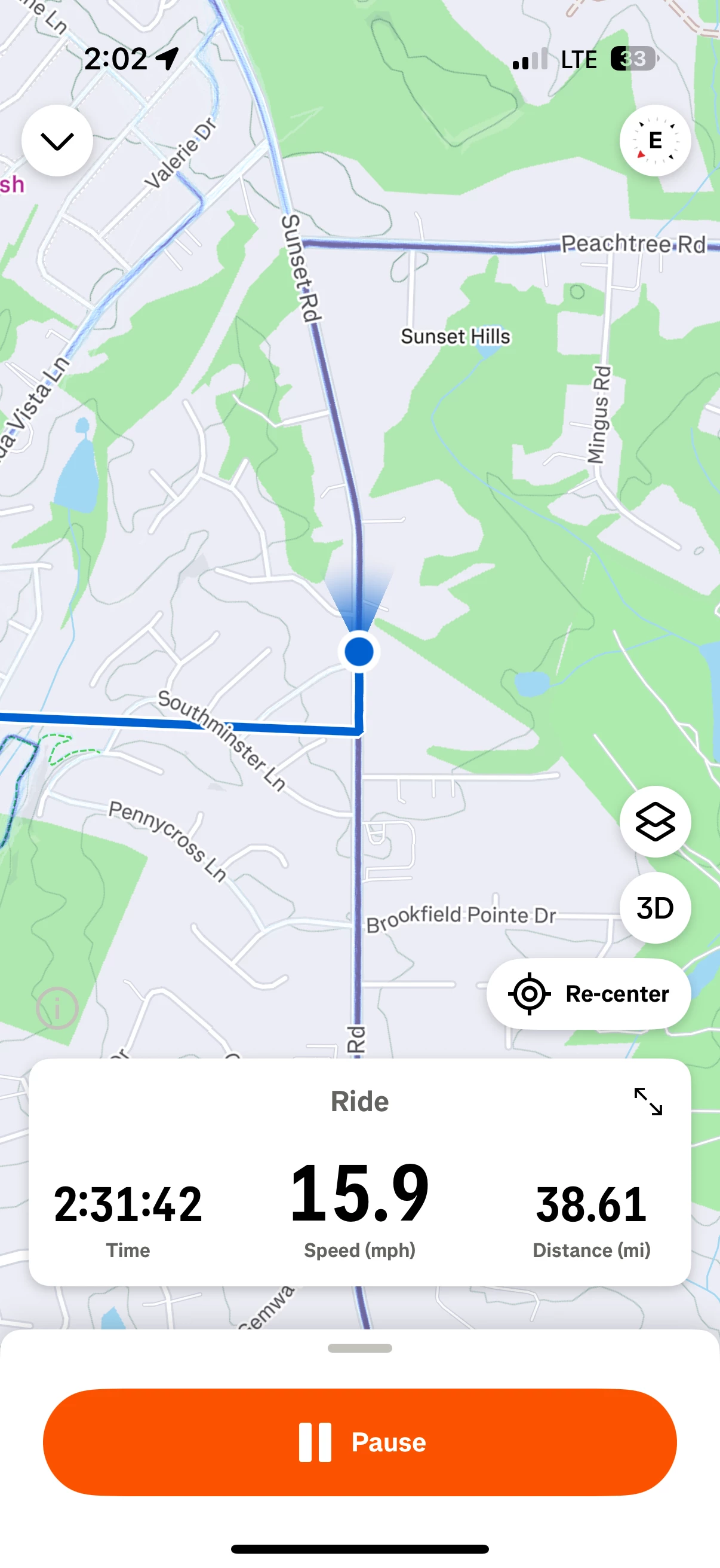
Recently, the Strava interface changed on the ride screen on my iPhone and now there is a giant “pause” button taking up a good amount of space at the bottom of my screen. This is bad design. Not only is it taking up unnecessary screen space, the big button can be easily tapped by accident. My last two rides, I have had lots of miles not get properly recorded because I inadvertently had tapped the pause button without knowing it. And of course, when you click resume and you’re in a different location, then you get those straight lines and not the GPS tracks. This is just bad design. Strava Team, if you are reading this, please do something to correct it. Thank you.


