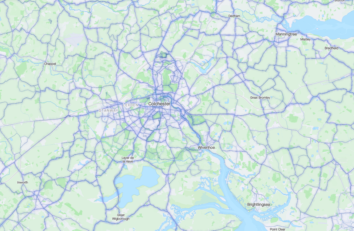
The weekly heatmap doesn't seem very useful. Because the heat scale is global, areas with a lot of cyclists just show almost every road as red, and areas without a lot of cyclists just show everything as blue. It's OK, though not great, in high-usage areas but, in lower-usage areas, the heatmap just looks like an ordinary road map, except that a few very minor roads are coloured "barely anyone cycles here" rather than "only a few people cycle here".

To be useful, I think there needs to be a way of adjusting the heat scaling, so that one can set the most popular roads in a given area to show up red, even if they're not very popular on the global scale. There could even be an option in the user interface to automatically scale the heat so that the most popular road displayed at the moment is red, regardless of how popular it actually is.


