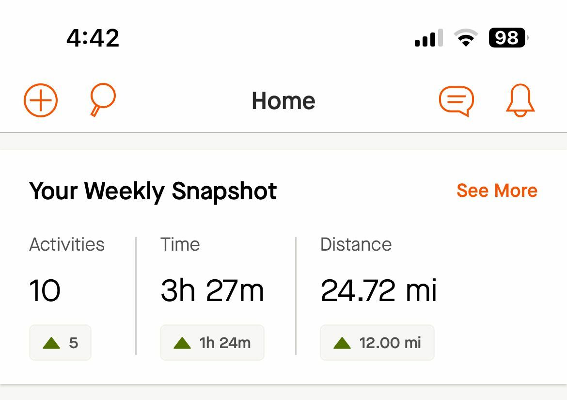
I do not want this option on my feed.  It popped up a few months ago and went away.  It is now back.  I am hoping now that it is back- I can remove it.


The widget itself seems to be primitive and only collects quantity rather than quality.  Then every week it challenges you to do more.  Rest is also very important and needed to prevent injuries. 


 Some might think it's great, and that's awesome for them.  I do not think it is good to see and why I have disabled things like the 'move' option on my garmin watch or removed the step counter option.

Hello @Jzeeee 


Thanks for posting about this.  Can you provide a bit more information on exactly where you are seeing this?  For example, is this on the Mobile App, Web, or both?


Hi Jane!

It is on the mobile app, but not on the web browser. 

Thank you, 


Hey @Jzeeee
Thanks for the additional info. You should be able to delete the widget at any time. If you are having any issues doing this, please submit a support ticket and our support team can assist you.


I tried figuring it out and going to a support ticket - I still don't see it.  It's that weekly progress thing at the top of my app.  I cant remove it.  Others have tried and are thanking that they don't have this on their screen.  Considering I have been beta tested twice and I have yet to get a concrete solution, I do not know why I am a premium member.  I have been so disappointed with this response and 'solution'


  Looking at your suggestion to find a solution on IT help this is not what I am talking about: https://support.apple.com/en-us/HT207122


Please provide a screenshot of this "widget"! 


Please see image


upvote here to have the option to remove the weekly snapshot please. 


Hello Jane, 

It appears in the mobile app. 

Is there already a solution to remove it or hide it? 

Thanks, 

Joan


I also want this off of my feed! I can look at my progress on my progress screen. Each week is different and it feels shamey when I have a lighter week. 


How do we remove this weekly snapshot in the app please?


This thread says it was solved but like everyone the solution is to submit a support ticket? There no actual option to remove the weekly snapshot. Please advise. I’ll submit a support ticket too now.


Yeah.  It hasn’t.  I gave up on asking.  

please do! Maybe they’ll give an option to remove.  It’s now on everyone’s feed. I’m just glad the ticker colors aren’t bold and red anymore when you have a down week.  

It’s a terrible feature because it pools my biking, running, and gym time all together.  


Agreed.  I don’t need it! We should be allowed to remove it.


Hello!  Thanks to everyone who has posted on this thread.


I think there may be some confusion between 2 different things, and I wanted to help clear it up.  Widgets on the home screen of the IOS App can be customized and removed.  Find out more about widgets here.


As mentioned in the solution for this post, please submit a support ticket if you are having trouble removing the widget.  


It sounds like some of you are referring not to the Home screen widget, but to the Weekly Snapshot that shows up at the top of the Mobile Feed.  The Weekly snapshot is a different thing, and cannot be removed.


We are collecting feedback on the Weekly snapshot here, and would welcome your comments and suggestions.


Sincere apologies for any confusion.


I want the iOS Strava app to go straight to ‘Profile’ with the ‘this week’ graph which is actually a graph of the last 12 weeks by activity. This is good. I like this. 

However for some reason the app goes to ‘you’ ‘progress’ and it presents a graph which is almost a replica but is confusing and hard to understand. 

Basically this graph has ruined Strava for me!! Ha. I’m not sure why but I hardly open the app anymore because that opening graph is just confusing and awkward. It’s scaling and lack of axis as well as it’s always on the wrong sport and time frame. I dislike it intensely. 

Can it be removed or is anyone aware of a Strava alternative. I don’t want any social features just an easy way of looking at exercise data aggregated from my Wahoo and Apple Watch. 


Reply