cancel
Showing results for 
Search instead for 
Did you mean: 

Apple Watch Complication Icon

JibberJabber
Shkhara

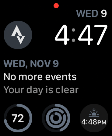
With WatchOS 9.x the Strava complication icon appears to be quite hard to see, but I’m reasonably sure it used to be quite clear. I’ve explored changing the watch face but it doesn’t appear to restore the original icon style.

Anyone noticed this?

D251AD2A-0E92-4BBD-867A-A4FF31666249.png

In this article you can see what it possibly used to look like: https://support.strava.com/hc/en-us/articles/115000161184-Strava-Apple-Watch-App.

2 ACCEPTED SOLUTIONS

Soren
Denali

Hello @JibberJabber and thank you for surfacing this! This visibility issue is on our radar so stay tuned for upcoming improvements rolling out soon.

View solution in original post

Soren
Denali

Just a quick update on this, an improvement for the complication icon was rolled out today! 

View solution in original post

4 REPLIES 4

Soren
Denali

Just a quick update on this, an improvement for the complication icon was rolled out today! 

I assume this is the new solid orange circle? I’m afraid I disagree and now find it very visually intrusive on my everyday watch face. It makes it quite mis-matched with most other icons. Please change back.

Looks great, thanks!

089ED80D-73FE-4F22-88A9-3409B5CD1B19.png

Soren
Denali

Hello @JibberJabber and thank you for surfacing this! This visibility issue is on our radar so stay tuned for upcoming improvements rolling out soon.