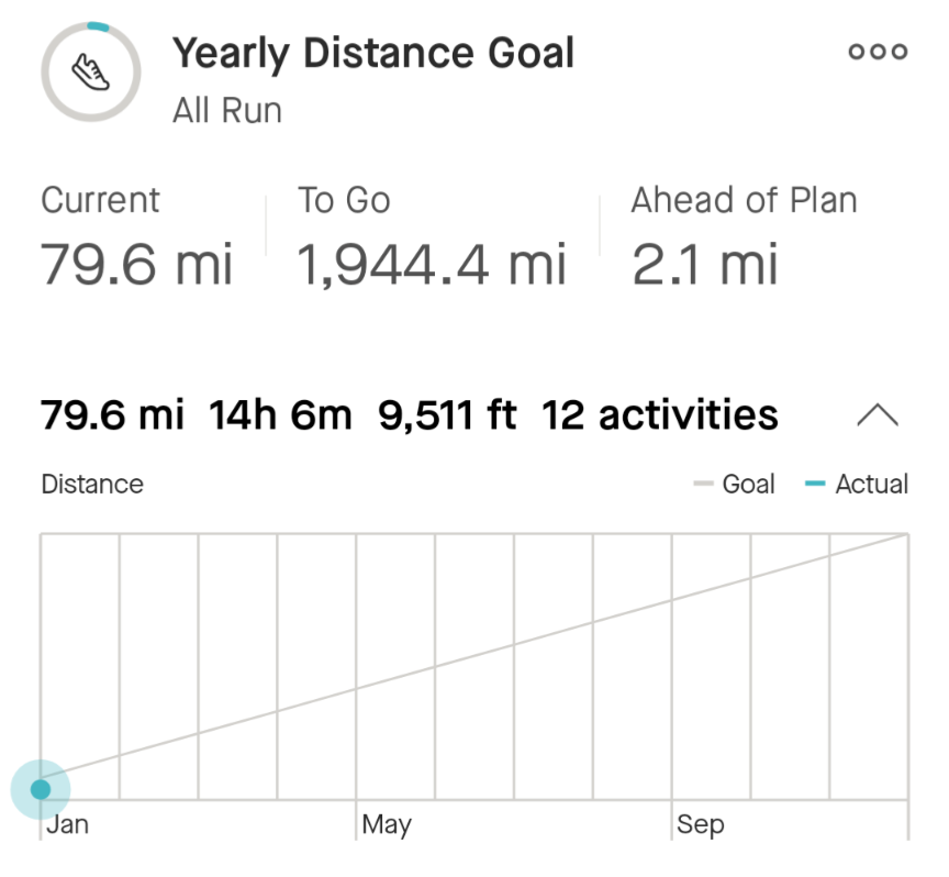
It seems odd that the graph below for the yearly goal shows only 11 months and January is excluded. The labels under the graph show Jan where the data for February is. See the picture below:

Any progress starting from February 1st is shown properly on the graph and you can see whether it is below or above the goal line. But anything logged in January is shown as a dot at the beginning. That seems like a really odd design.
Also, I should mention that if the goal is exceeded at the end of December, that doesn't fit on the graph because the top of the graph aligns with the goal line.


