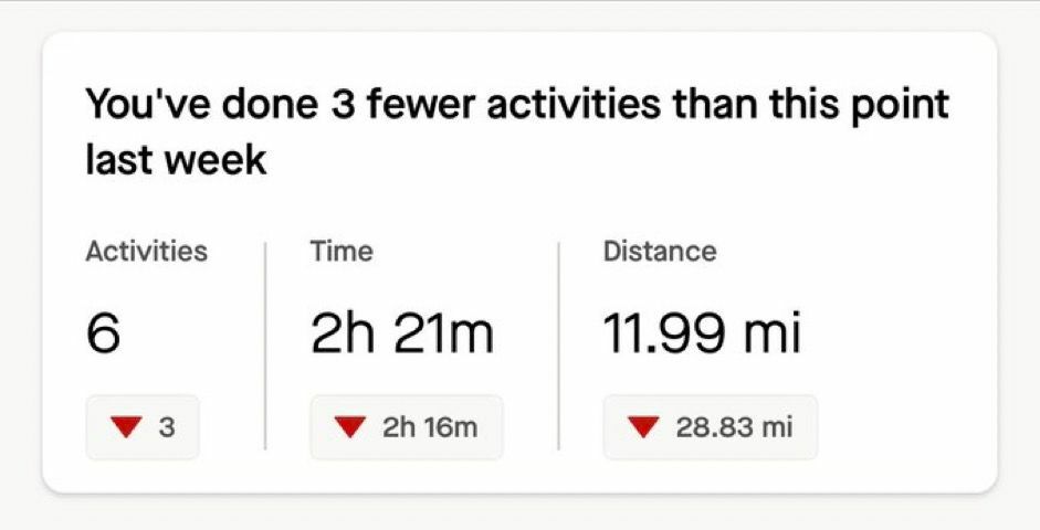
I’m now seeing the “Your Weekly Snapshot” at the top of my feed when using the app. I do not enjoy how this serves almost entirely to make me feel bad about my effort so far in the current week. This is detrimental to my experience on Strava. 


My training schedule each week is highly variable due to plenty of factors such as work, personal commitments, weather, etc. I should not have to see a feature telling me I haven’t been working as hard when I have been putting in more or the same amount of effort as my schedule allows. 


Please enable a toggle for this feature so we do not have to see it. 

Agreed. The totals are whatever, I don't find them useful but I don't actively dislike them either. But the arrows are totally divorced from what good training entails. Let me have the option to turn them off!


For someone like me who is trying to break obsessive habits around exercise it's a bit jarring to open the app and have that be the first thing I see. Logically I know "it's a Monday at 0600, of course there's going to be zero hours" but I still find it annoying. It's obviously a personal problem, yet it seems like such an easy fix to add a toggle off option.

I'm glad people find the data beneficial, but I've got beef w/ the red arrow. 🙂


Someone should tell the Strava Developers they didn’t include a TMZ conversion in their weekly CRON/or api which resets/fetches snapshots. Just a little QC note 🙂


I have also written to Strava to ask them to reconsider this feature or at least make it optional, as others here have suggested. It’s already frustrating that weeks have a mandatory Monday start. Now this useless comparison tool is added with seemingly no user input and no logical way of actually comparing this week to the previous. I also find it to be quite negative to open the app and have the first thing I see be a row of angry red arrows. I try to use Strava mindfully, as I try to approach all fitness and movement mindfully. Sometimes that means not tracking every tiny little activity I do, and focusing instead on tracking my miles as I’m working towards a big goal like a marathon. Apparently the result is that almost every single day I now see red down arrows, even though I’m logging a lot of miles to prep for my marathon. Competition and comparison (even with yourself) can easily turn into an unhealthy obsession or even a life-threatening eating disorder or mental illness that can affect quality of life. I’ve been able to use Strava’s in-app options to have a good experience up until now. I really hope Strava reconsiders this feature. I will be reconsidering paying for and using an app that feels unhealthy and could contribute to disordered behavior among others, too. Please help us build a community that allows us to put our well-being first, Strava. 


Of weak minds

your are your work, embrace it, don’t hide from it


Yes. Fck weekly snapshot!!


I used to like opening Strava and seeing my lovely friends activities, now I see this awful red red red. It makes me feel rotten! Not a fan.


Please remove the weekly snapshot. This is terrible for mental health ☹


Since I posted this in January, two changes have been made. 

  • Arrows are now grey instead of green/red
  • The information is smaller but inexplicably lies within the same size box atop the feed

This is not helping! The same effect still happens when I open my app and have to see those numbers. It is still designed to make you want to do “more more more” to an unhealthy level. PLEASE let us disable this feature to give us the peace of mind and our feed back. 


I agree completely with Windrunner, please make ‘Your weekly snapshot’ a toggleable item with immediate effect. 


I find the snapshot at the top of my feed absolutely dreadful. It isn't useful for training, please at least make it optional. I have been considering deleting the app as it seems to align more with the negative aspects of social media, encouraging always more engagement and comparisons. I absolutely hate this feature. 


Please let us choose if we want to have this snapshot docked on top of our feed or not.

I sincerely hate it. If I want this info, I have an appropriate tab for it...

Thank you!


Fantastic.  So they should make it optional.   You'd want it enabled, others want it disabled.   Choice is a great thing.  


Agree that this feature should be optional. There are many legitimate reasons to modulate intensity and volume. Strava is not a coach, and having these numbers at the top of the feed constantly is distracting.


As someone recovering from an eating disorder and trying to use Strava in a mindful and healthy way, I completely agree with your statement and find the weekly snapshot really off-putting, and it appeals to that negative voice I fight daily that tells me I'm not doing enough.  I have the tools and mindset to combat this now, but I really don't see any positives for this feature.


Came here looking for a way to make this optional - it feels very much like it should be. I feel like this is doubling up on the information Strava already provides in the progress tab under "you". If I want to view that data I know where to find it.

There are other "forced reflections" that could also be made optional like "this time last year" showing a similar event you did last year -  this such a pain when your trying to review/edit and manage a triathalon event you do each year - it splits into  5 different events, then your dealing with this years and last years version .. ahh! Please make that optional as well.

Its possible your overloading the feed Seems to be generating a lot of anger and frustration - hopefully you can find the balance. Thanks for taking my feedback!


This feature should be optional. It might be loved by others but I’d like to remove it! 


I really hate this feature. Can it please be optional? 


Just logging my views here on the 'weekly snapshot' feature - I agree with others below that it should definitely be optional! On weeks when circumstances beyond my control mean I've not racked up the miles I'd have liked to, it's really not helpful or motivating to have this be the first thing I see when I open the app - if anything, it's potentially bad for people's mental health. 


Adding to the chorus: I would like to be able to turn off the "Weekly Snapshot" feature.  It sucks.  It's extremely off-putting.  It doesn't make me feel good when I'm "ahead of" the previous week's numbers, and it doesn't make me feel good when I'm "behind" the previous week's numbers either.  It encourages an unhealthy training mindset and undercuts the joy of exercise as a hobby.  It's absolutely insane that this useless and off-putting metric is the first thing I see when I open the app.  Hard to imagine a mostly competent company like Strava insisting on such a terrible feature. 


+1, this feature and its corresponding weekly notification is incredibly distracting. Can subscribers please just get a clean app without these patronizing features ("You did great last week! Keep up the progress!") We don't need this.


I completely agree. I’ve now unsubscribed as of this month. Strava used to feel like a fun and positive place. Now, with these recent mandatory changes, among with the high monthly price, I can no longer support this app. Strava doesn’t seem to care about its users enough to take concerns like these seriously. 


It would be more useful if it was a rolling 7 days and did not reset on. Monday.

It should be configurable. I would remove right now if I could.


Reply