- Home
- Help & Ideas
- Strava Features Chat
- Re: Strava fitness graph is bogus
- Subscribe to RSS Feed
- Mark Topic as New
- Mark Topic as Read
- Float this Topic for Current User
- Bookmark
- Subscribe
- Mute
- Printer Friendly Page
Strava fitness graph is bogus
- Mark as New
- Bookmark
- Subscribe
- Subscribe to RSS Feed
- Permalink
- Report Inappropriate Content
09-03-2023 09:54 AM - edited 09-03-2023 09:57 AM
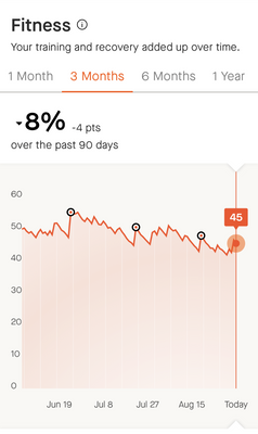
This is my fitness in the last 3 months according to Strava as I am training for an upcoming 100 miler. In reality this couldn't be any further from truth. My aerobic fitness went up significantly. I handle heat much better than 3 months ago, and I recover quickly from long training runs.
What Strava calls fitness is highly misleading. This should be called something like acute training load as this gives a lot of emphasis on time spent in high intensity. But that isn't fitness as people who end up training too hard (at too high intensity) all the time tend to plateau. This doesn't encourage to train smart and only works to reflect noob gains for people who have just started exercising.
Also consider the fact that the biggest gains in "fitness" on this graph are from finishing races. But again that is false. Running a long distance race in fact suppresses fitness for a few weeks as the body needs to recover from a higher than usual stress.
- Mark as New
- Bookmark
- Subscribe
- Subscribe to RSS Feed
- Permalink
- Report Inappropriate Content
03-18-2024 12:16 AM
Absolutely useless feature, this is why I will not continue my subscription this year. I have high intensity weight trainings which are like 90 mins and my simple commute ride to the office (~30 minutes) generate 3 times more relative effort then my weight trainings. It is a joke. I use a proper chest HR every time, my avg is 120 and max is 150, but gives me less than a long walk.
- Mark as New
- Bookmark
- Subscribe
- Subscribe to RSS Feed
- Permalink
- Report Inappropriate Content
03-17-2024 01:32 PM - edited 03-17-2024 01:33 PM
This needs to be changed. My fitness has apparently dropped 12% in the past 12 months yet 1 year ago I ran a 4.04 marathon and a 1.47 HM. Within the last 2 weeks I’ve run a 1.28 HM and a 3.18 marathon and my fitness has dropped??!!
- Mark as New
- Bookmark
- Subscribe
- Subscribe to RSS Feed
- Permalink
- Report Inappropriate Content
03-17-2024 11:55 AM
No question, of all the “features” in Strava, this measure of fitness is 100% the most useless and misleading.
- Mark as New
- Bookmark
- Subscribe
- Subscribe to RSS Feed
- Permalink
- Report Inappropriate Content
03-17-2024 11:51 AM
Thanks for posting this. I whole heartedly agree. This graph promotes overtraining.
- Mark as New
- Bookmark
- Subscribe
- Subscribe to RSS Feed
- Permalink
- Report Inappropriate Content
03-17-2024 11:54 AM
No question, of all the “features” in Strava, this measure of fitness is 100% the most useless and misleading.
- Mark as New
- Bookmark
- Subscribe
- Subscribe to RSS Feed
- Permalink
- Report Inappropriate Content
02-12-2024 05:10 PM
I fully agree! The fitness chart is just an activity log. It really doesn’t accept recovery as part of training plan. I do long/slow runs in prep for ultra distances and Strava really doesn’t really seem to understand.
I was hoping it would be more useful.
- Mark as New
- Bookmark
- Subscribe
- Subscribe to RSS Feed
- Permalink
- Report Inappropriate Content
09-08-2023 08:14 AM
@Silentvoyager The term fitness is indeed misleading but unfortunately it's the established wording in sport science for showing how much do you train at your limits besides "Chronic Training Load", which means exactly the same. The graph matches your description of your training, because it's all relative to you abilities and when you get better but your heart rate isn't so often in the red zones it means you didn't train as hard as before from a cardivascular point of view.
- Mark as New
- Bookmark
- Subscribe
- Subscribe to RSS Feed
- Permalink
- Report Inappropriate Content
09-08-2023 09:53 AM - edited 09-08-2023 09:57 AM
Yes, I understand exactly what this graph means. I'd still argue that it confuses a lot of users. I can't tell you how many https://www.reddit.com/r/Strava/ posts I commented on about this graph. Perhaps it is terminology but I'd insist it shouldn't be called "Fitness" because it doesn't reflect fitness. And if someone wants this graph to keep going up they need to exercise harder and harder which would inevitably lead to a burnout.
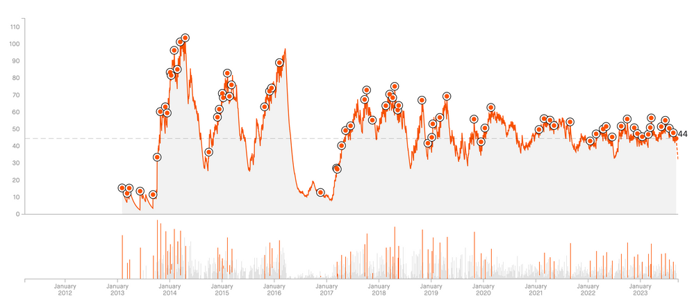
Here is my graph for the last 10 years (apparently I can see that on the website):
If you look at years 2014-2016, I used to train hard all the time so my average HR was way higher than it is now, so the impact on this graph was higher. According to this graph, at the peak in 2014-2016, my fitness was 2x higher. But that isn't true. Currently, despite being 10 years older, my VO2max is higher and I can sustain higher volumes of training. I am faster on uphills. And, also, I've just set a PR on a fast 50km race course - one that requires to sustain speed over multiple hours - the same that I ran in 2014. In fact, looking at the Training Impulse for exactly the same race - in 2014 it was 729 and this year it was 531 - that is despite the fact that I finished that race faster this year and set a 50k PR. So does that actually reflect fitness?
Now, if you look at the beginning of 2016 - where the graph went down sharply. That was a real burnout - an overtraining that caused serious health issues and landed me in a hospital, and took a long time to recover from. That's what training at a higher intensity all the time may lead to.
Could I use a bit more high intensity training? Absolutely! Would that be reflected in the graph? Perhaps. But my main point is that what this graph shows is not fitness and that trying to keep going higher all the time would encourage bad training patterns and lead to a burnout.
- Mark as New
- Bookmark
- Subscribe
- Subscribe to RSS Feed
- Permalink
- Report Inappropriate Content
09-08-2023 03:58 PM
I agree, it shouldn't be called fitness just because the scientists came up with this completely misleading word. Trainingspeak and other platforms use CTL for Chronic Training Load instead, that would need explanations for the users too but at least nobody would think this graph reflects if they got better or worse.
In the Strava browser the fitness/freshness graph can display the "form" too, event that word is misleading but it's a useful indicator if someone is near overtraining if it's to deep in the minus. This should be displayed in the app too and in both cases not only on demand as this indicator is more useful as the "fitness".
- Mi fitness not syncing old data in Devices and Connections
- Relative Effort Changed Based on Added Pace Zones, Not HR in Strava Features Chat
- Pairing Geoid HS500 in Devices and Connections
- Better Integration with Concept 2 Devices (Ski Erg, Row Erg, Bike Erg) in Ideas
- Rename "fitness" to "recent training load" in Strava Features Chat
Welcome to the Community - here is your guide to help you get started!


