
Map Types are a clever way to enhance your activity’s map appearance in feeds. We’ve enjoyed seeing how our employees have been using them so we’ve captured examples of the different styles below.
What
Map Types, also known as Personalized Stat Maps, are a way for you to change the color and shading of your path (we call it a polyline) to reflect statistics, seasonal holidays, or important causes. Athletes can choose from the following styles (note some may be seasonal and not represented in this list): 3d terrain, pace or speed, heart rate, elevation, gradient, power, time, surface type, and temperature. We also have styles to bring awareness to important causes like: Black Lives Matter, Pride, Support Ukraine, and Strava Metro.
If another athlete has chosen to apply one of these map types, their path/polyline will be colored and shaded according to the style they selected. You’ll see these styles on feed maps such as the home, club, and profile feeds. Note: The web home feed does not currently display these map types.
How
To choose additional map styles, tap the ellipsis icon in the upper right-hand corner of the activity and select Edit Activity > Change Map Type. Certain styles are only available for subscribers. You can learn more about the feature here.
Employee Examples
We've asked employees to share examples of activities on which they used stat map types and why they've chosen that particular style. Stay tuned for “Part 2” of this topic where we cover map types for holidays, causes, among others.
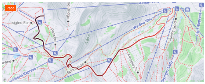
Heatmap
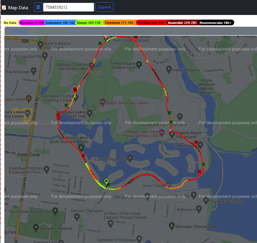
This map style will highlight which area of the map or route you've spent the most time on instead of showing GPS points all over the map. This allows the map to give insights into the distribution of how much time was spent where on the field or course. Soccer, Golf, and Surfing get this heatmap style by default.
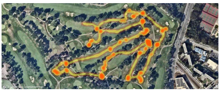
"I like the heatmap view for golf because it better visualizes where I spent time on the course. The satellite view is great too - it really shows how my round went!"
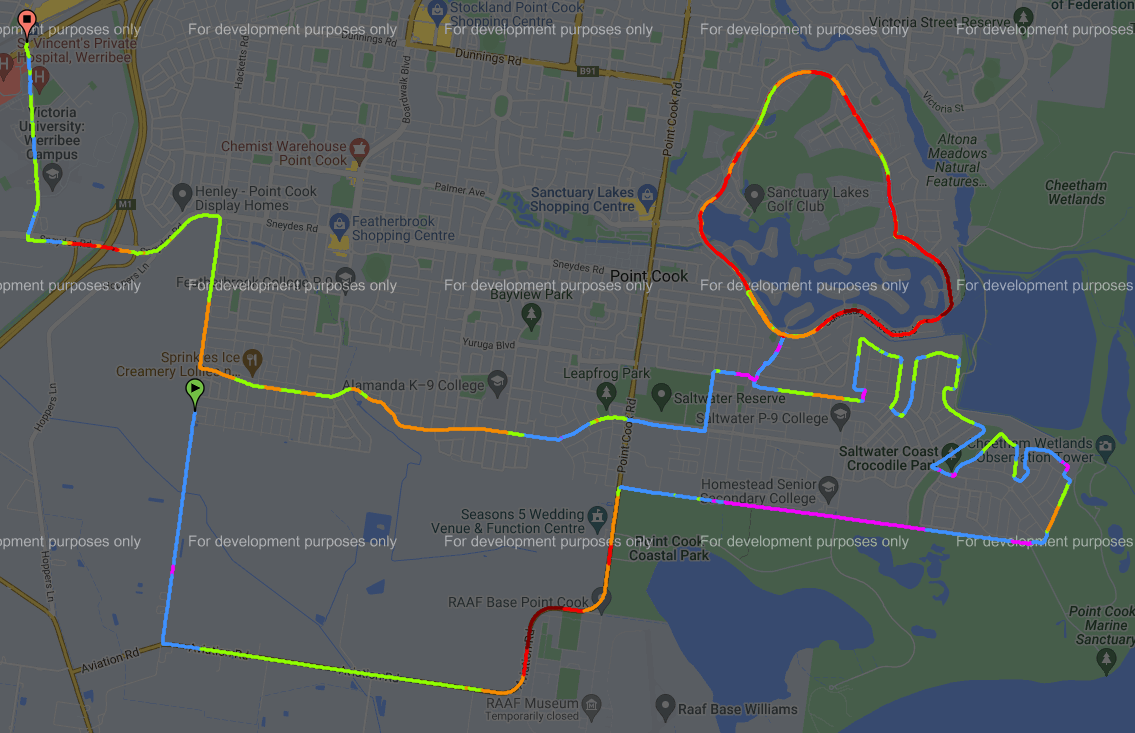
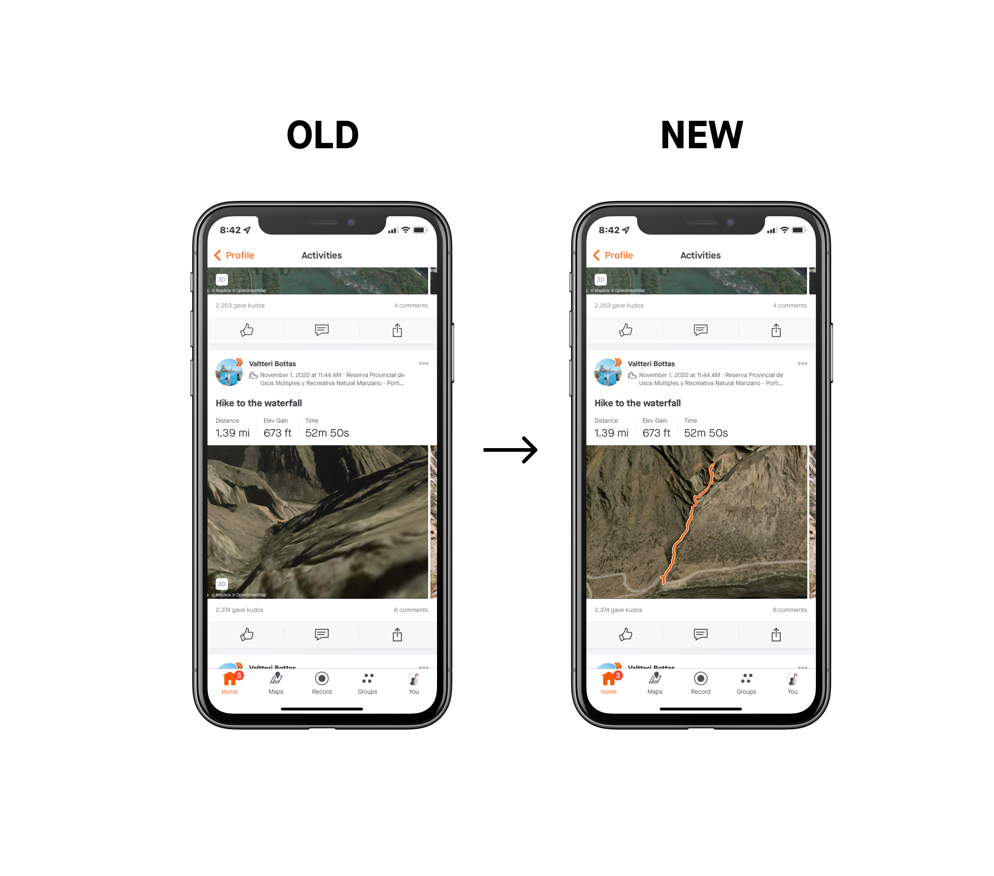
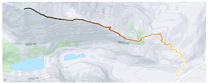
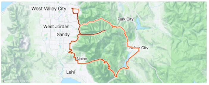
3D terrain
The polyline will be displayed on a 3D satellite map angled to easily visualize your path of travel among the terrain. This is the default map type for trail sports like hikes, trail runs, gravel bike, mountain bike, and e-mountain bike rides, however it can be applied to any activity type.
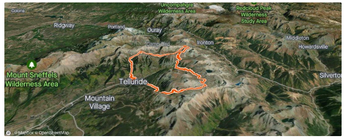
"It best exemplifies the struggle it was completing this activity”
Pace
Higher speed/lower pace will be a darker blue.
"I think the speed/pace map looks the most meaningful on rides/runs were the speed/pace is intentionally changed throughout. For this particular activity, I was alternating between slower and faster paces every 400 meters. From just the map I can glean meaningful nuances of an activity. I remember going by the boat launch during the 6th rep and this is clearly shown from just looking at the pace map."
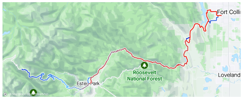
Speed
Higher speed/lower pace will be a darker blue.
"Riding in Colorado mountains produce wild speed changes due to climbs and descents. I chose this map type to show the changes in climbing speed vs descending speed and at what points in the ride I was barely moving, and at other points where I am (almost) literally flying."
Heart Rate
Higher heart rate will be a darker red.
"Heart Rate stat map was chosen here because I wanted to see how my HR progressed throughout the duration of the activity, as it turns out when you go uphill for a while, your HR goes up?"
Elevation
Lower absolute elevation will be yellow and higher elevation will be black.
"This was my first 14er - a common hike Coloradoans participate in where you climb over 14,000 ft above sea level- the Elevation map type reminds me of the great summit I’ve reached. It helps make my journey look more dynamic than the static orange polyline you typically see in an activity."
Gradient
Descents will be yellow and inclines will be red.
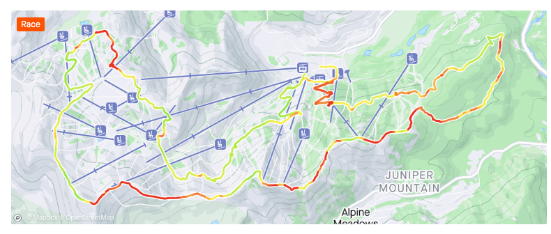
"I chose this map because this event was at a ski resort and I thought it would be interesting to see the drastic changes in grades along the route represented by colors."
Power
Higher power will be darker purple. Please be aware this map treatment is not available for activities with estimated power.
"I chose this map as a reminder to myself to never go out that hard again at the beginning of a long ride. The darker purple shows a much higher power and then the second half of the ride was soft pedaling and trying not to cry/collapse as I rode back home."
Time
Longer elapsed time will be a darker red.
"The time map was chosen because of the longevity of this ride was fairly substantial, that I originally did not anticipate. The duration of this ride lasted over 8 hours. That required more poptarts and took much longer than anticipated, due to the climbing."
Surface Type
Dashed lines are unpaved, solid orange is paved, and white is unspecified.
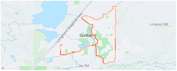
"This was a great map to show anyone who sees it that the run was on incredibly varied terrain and was a fun route that stitched together a trail network and neighborhood paths."
Temperature
Higher temperatures will be a darker red.
"This was a ride up to Trail Ridge road (the highest continuous paved road in North America) that gets up to 12,000ft at its highest. I chose this map due to the incredible temperature differences that occur on that road vs. where my starting point was. 46ºf at the summit vs. 95ºf in Fort Collins."
Have you used any of these map styles? If so, tell us which and why?