- Home
- Help & Ideas
- Strava Features Chat
- Re: Heatmap changes
- Subscribe to RSS Feed
- Mark Topic as New
- Mark Topic as Read
- Float this Topic for Current User
- Bookmark
- Subscribe
- Mute
- Printer Friendly Page
The Hub is now in read-only mode as we make improvements to the Hub experience. More information is available here.
- Mark as New
- Bookmark
- Subscribe
- Subscribe to RSS Feed
- Permalink
- Report Inappropriate Content
01-25-2024
08:05 AM
- last edited on
04-18-2024
11:14 AM
by
Jane
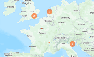
What have you done to Heatmaps? I do not care about businesses, or where other people have run, walked, or biked, and the new color selection interface does not allow basemap changes from the same interface (as it should). Also, as I zoom out, the once-useful aggregation of workouts (showing a circle and number at scales where the actual paths get tiny and useless) is now gone. Writing this as a cartographer, recent changes are not an improvement. Is there a way to recover the old display mode?
Solved! Go to Solution.
- Labels:
-
Heatmaps
-
Maps
-
ProductFeedback
- Mark as New
- Bookmark
- Subscribe
- Subscribe to RSS Feed
- Permalink
- Report Inappropriate Content
04-29-2024 01:19 PM - edited 04-29-2024 01:29 PM
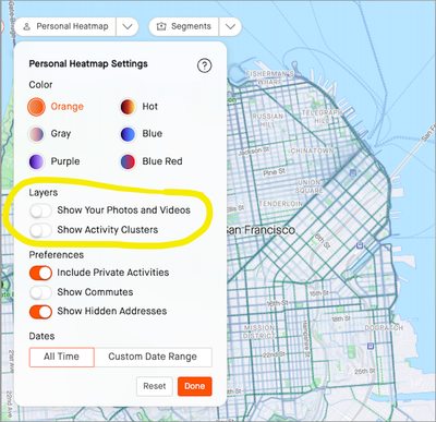
Hello Everyone. Clusters are back, and now they work for all sports. Thank you for your feedback and for your patience while we updated it to work for the new sport filtering options. Let us know if you have further thoughts. We're always glad to hear from ya!
- Mark as New
- Bookmark
- Subscribe
- Subscribe to RSS Feed
- Permalink
- Report Inappropriate Content
04-23-2024 04:44 AM
There are options at the top of the map, when you click personal heatmaps you can toggle it off thankfully
- Mark as New
- Bookmark
- Subscribe
- Subscribe to RSS Feed
- Permalink
- Report Inappropriate Content
04-24-2024 10:21 AM
Thank you - I hadn't spotted that 🙂
- Mark as New
- Bookmark
- Subscribe
- Subscribe to RSS Feed
- Permalink
- Report Inappropriate Content
04-22-2024 12:44 PM
Keeping this thread alive. This still stinks. Bring Back Activity Clusters!!!!!!
- Mark as New
- Bookmark
- Subscribe
- Subscribe to RSS Feed
- Permalink
- Report Inappropriate Content
04-18-2024 11:24 AM
Agree with much of the feedback here. Please bring back the function in the heatmaps that allows you to see where and how often you have run in the world. I'm not interested in the photos, but in a global overview of my activities.
- Mark as New
- Bookmark
- Subscribe
- Subscribe to RSS Feed
- Permalink
- Report Inappropriate Content
04-18-2024 09:23 AM
Hello everyone. Thanks again for all the feedback. We are working on a complete overhaul of clusters and should have positive news for you all shortly...Appreciate your patience!
- Mark as New
- Bookmark
- Subscribe
- Subscribe to RSS Feed
- Permalink
- Report Inappropriate Content
04-18-2024 04:31 PM
Please. No "overhaul" is necessary. I know coders like to code, but there can hardly be anything so graphically simple and expressive as the symbology you formerly used. Simple graduated circles (according to number of activities), with a number inside, would be hard to beat. If you can do it, then kudos to you, but hopefully there's a skilled cartographer on your staff to provide guidance and tell you there's more bang for your effort to be had elsewhere.
- Mark as New
- Bookmark
- Subscribe
- Subscribe to RSS Feed
- Permalink
- Report Inappropriate Content
04-27-2024 12:23 PM
the clusters were simply perfect, please do not spoil this with overhauling; if i can opt out pictures and opt in clusters i am happy again; i joined premium only for the heatmaps....
- Mark as New
- Bookmark
- Subscribe
- Subscribe to RSS Feed
- Permalink
- Report Inappropriate Content
04-17-2024 11:21 PM
#bringbackclusters
Strava developers: when will the activity clusters be re-implemented??? How hard can it be? It was a feature which was there already and then who decided it to let go of the clusters and why? Bring the clusters back!
- Mark as New
- Bookmark
- Subscribe
- Subscribe to RSS Feed
- Permalink
- Report Inappropriate Content
04-12-2024 01:47 AM
the circles of aggregates were great - hope to see them back asap!
- Mark as New
- Bookmark
- Subscribe
- Subscribe to RSS Feed
- Permalink
- Report Inappropriate Content
03-30-2024 10:18 AM
Late to leave comments, but adding my two cents:
Still missing activity clusters, but have seen the photo clusters as other mentioned. This doesn't have the same effect as I (along with others), don't post photos. People have mentioned this, but adding another comment to reinforce that we miss the clusters allowing easy view of all the areas I've run and how frequently...
Personally, I also miss the easy date changer (i.e. 2021, 2022, 2023). The slider is a nice addition, but if I had to choose between the slider and just a flat out year time frame, I would opt for the year. I find it interesting to see what areas were popular in a given year and on my personal map as I move around.
Welcome to the Community - here is your guide to help you get started!


